
Bridge Figma & Power Apps Without Design Debt

You’ve probably had that moment: you open a Power Apps canvas app you built “quickly,” and suddenly every button looks like it came from a different decade. I’ve been there—copy/pasting controls, tweaking colors one-by-one, and promising myself I’d “clean up the design later.” Then I watched a demo from a veteran IT builder (20 years in the game) who got tired of that gap and built a bridge: Power Apps for Figma. The pitch isn’t just “export/import.” It’s more like: stop losing your design decisions the minute you start building. If you’ve ever wanted Figma-level polish without the endless rework, this is your rabbit hole.
The ‘Design Debt’ You Keep Paying in Power Apps
You don’t notice it at first. You ship a quick screen, then another, and soon your responsive canvas apps start to feel “off.” Spacing is close but not consistent. Colors are almost the same, but not quite. Buttons line up… until they don’t. This is design debt: the small visual compromises you keep paying for every time you touch the app.
Symptoms you’ve normalized in your Power Apps design system
- Mismatched padding and spacing between similar components
- Random colors that drift from the original intent
- Controls that “almost” align, especially across breakpoints
- Duplicate styles because you copied a control instead of reusing a pattern
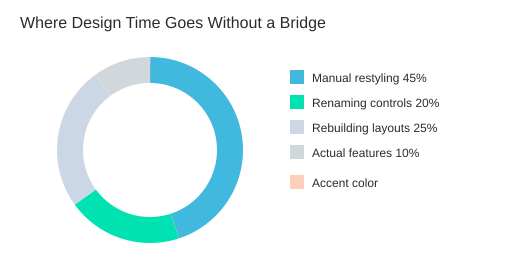
The real problem isn’t that you can’t design. It’s that you’re rebuilding screens manually instead of translating intent. When you recreate a layout by hand, you introduce tiny differences—then you spend hours chasing them later.
Quick self-audit: count the rework
Ask yourself: how many times did you tweak the same color across controls this week? If you’re doing “just one more adjustment” on every screen, you’re paying interest on design debt.
| Illustrative checklist | Count |
|---|---|
| Color fixes per screen | 5 |
| Screens in app | 20 |
| Total manual fixes | 100 |
This is why teams ship faster when design handoff is structured. A shared workflow reduces rework, and naming conventions reduce downstream maintenance when you’re debugging, refactoring, or handing the app to someone else.
Decide what you actually need (before you scale)
Be honest about your goal. Do you need:
- Pixel-perfect UI that matches your Figma file
- Reusable patterns that behave the same across screens
- Faster handoff from design to build (or build back to design)
Most teams need all three, which is why a bridge from Figma to Power Apps matters. Low-code doesn’t remove design work—it just hides it until Friday afternoon, when your “quick app” suddenly becomes production on Monday.
“From the management perspective that it's great to automate my processes—automate everything.”
That automation mindset is the point: you need one source of truth for layout, naming, and styles inside your Power Apps design system—before your app grows past 20 screens and every change becomes a visual scavenger hunt.
Power Apps for Figma: What It Is (And What It Isn’t)
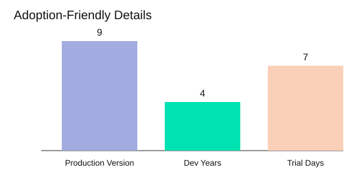
Power Apps for Figma is a Figma plugin for Power Apps that helps you move screens and styles between Figma and Power Apps canvas apps—without turning every change into a rebuild. As the speaker puts it: production is currently on version 9, after about four years of development, and you can find documentation, roadmap, and a trial link via the in-plugin QR code.
“The plug-in… helps people to make really beautiful designs from Figma to Power Apps or from Power Apps to Figma.”
What it is: a two-way bridge for Figma to Power Apps
The core promise is simple: you design in Figma, then bring that work into Power Apps to build faster. And when the app changes, you can send parts back to Figma for redesign. This two-way loop matters because two-way design/build workflows reduce rework: you iterate where it’s easiest, then sync, instead of redoing layouts by hand.
- Figma → Power Apps: take screens, components, and styling intent into a canvas app build.
- Power Apps → Figma: pull what you built back into Figma to refine UI and keep design files honest.
What it feels like in practice (no chaos loop)
Inside Figma, the plugin sits like a visible “widget” on the right side of your file. Your workflow becomes repeatable:
- Redesign in Figma
- Iterate with stakeholders
- Export from the plugin
- Paste/import into Power Apps
- Repeat as requirements change
This is how you avoid design debt: you keep design and build connected, so small UI changes don’t trigger big rebuilds.
What it isn’t: not magic, not “taste,” not a free product
This tool won’t replace judgment. You still decide what should be a component, what should be responsive, and what should be simplified for real users. Tools don’t replace taste.
Also, set expectations on access: the plugin is paid (with some free features), but it can still work even if you’re on free Figma. That compatibility increases accessibility—especially when one file/one page is enough for many enterprise screens. And adoption is easier because you can reserve a 7-day trial, which lowers friction for teams that want to test before committing.
| Detail | Value |
|---|---|
| Current production version | 9 |
| Development time | 4 years |
| Trial length | 7 days |
| Figma subscription | Works with free tier (Pro optional) |
| Plugin pricing | Paid (some free features) |
A Quick History Lesson (2023 → 2026) That Actually Matters
If you want to Bridge Figma & Power Apps Without Design Debt, it helps to know how the tooling got here—because product maturity usually follows a pattern: focus → expansion → refocus. The demo history of Power Apps for Figma is a clean example of that timeline.
2023: Start small (and yes, v1 was rough)
Development started in 2023 with a simple goal: basic import/export of a few Power Apps screens. As described in the demo, the first version “was not great.” It mainly worked from JSON, and later YAML appeared from Power Apps—setting the stage for what you now think of as Power Apps YAML export.
If you’ve ever shipped v1 and cringed later, you’ll relate.
2024: Feature expansion… then a deliberate refocus
In 2024, the plugin expanded: people could upload from a zip file, and there was even a flirtation with model-driven scenarios and Power Platform automation (including Power Automate-related packaging). But the demo also makes the key point: the scope felt too broad, so the work was split and refocused on what designers and canvas builders needed most—canvas apps, clean visuals, and simpler import/export.
2025: YAML viewer, theming, and control swapping (real workflow wins)
In 2025, the plugin moved from “it works” to “it helps.” A YAML viewer made it easier to read YAML generated from selected screens in Figma. That unlocked practical design-to-build tasks like theming (backgrounds and colors) and swapping controls (for example, button → label, label → input). By the end of Q3 2025, the demo describes a more professional plugin experience: inspecting selected controls, seeing colors, and generating prefixes (a core mechanism the plugin relies on).
Q3 2025: Multilanguage support increases adoption
Internationalization expanded beyond English to German, Portuguese, and Chinese. This matters because consulting teams share tools across customers—more languages typically means faster adoption and fewer enablement delays.
2026: The big bet—AI chat-style UI (planned)
For 2026, the demo describes a major UI and behavior change, aiming to reduce the learning curve by presenting actions through chat.
“In 2026… we plan a huge change of the UI… everything will be presented in AI chat.”
The speaker also mentions a hoped-for release target in Q1 of “this year,” as described in the demo.
| Year | What changed | Why it matters to you |
|---|---|---|
| 2023 | JSON → YAML appears | Foundation for Power Apps YAML export |
| 2024 | Expand, then refocus to canvas | Less scope creep, less design debt |
| 2025 | YAML viewer + themes + swapping | Faster iteration between design and build |
| 2026 | AI chat UI planned | Lower learning curve for complex tools |
Under the Hood (Without the Boring Bits): Security + Architecture
Why this stack should make you feel confident
You do not need to be a developer to judge whether a tool will create design debt. You just need to see a clear, modern stack and a clean flow. This bridge is built as a TypeScript React plugin developed in Visual Studio Code, with changes tracked in GitHub. That transparency matters: clear architecture boosts enterprise adoption because your IT team can understand what runs where, and your makers can trust it will not break silently.
Microsoft Azure Functions: licensing + backend, not mystery meat
Licensing and backend services are composed on Microsoft Azure Functions. In plain terms, that means the “server-side” parts (like licensing checks and supporting services) run in a managed cloud environment instead of a random, opaque server.
“Everything is composed on the Microsoft Azure functions. So everything is… very secured.”
Azure Functions also supports a cleaner architecture: small, focused services that are easier to monitor and update without rewriting the whole system.
What “secure Figma plugin” recognition implies
The plugin was nominated by Figma as a secure Figma plugin (referenced as “last year”). You should treat that as a strong trust signal: it suggests the plugin met Figma’s expectations for safe behavior and responsible handling of data. It does not replace your own review, but it reduces the chance you are adopting something risky or poorly built.
Plugin vs widget: where it lives in your workflow
- Widget: stays visible on the right side, so you can keep controls in view while you work.
- Plugin: runs inside your Figma file/page and lets you manipulate content directly.
The anatomy: manifest → load → interact
Every Figma plugin starts with a manifest. That manifest tells Figma how to load the plugin, what UI it has, and what permissions it needs. The typical flow looks like this:
- Manifest defines the plugin entry points.
- Figma loads the plugin into your file.
- You select frames/controls and run actions to export or map design elements.
Quality controls: versioning + automated testing
GitHub provides transparent versioning, so you can see differences between releases and keep maintainability high. Automated checks using the V test framework help reduce regressions, meaning new updates are less likely to break existing design-to-app mappings.
Validate for your environment
Security claims and nominations are valuable, but you still validate: review permissions, confirm data handling, and run a pilot in your tenant before scaling.
| Item | Details |
|---|---|
| Backend hosting | Microsoft Azure Functions (Yes) |
| Dev stack | TypeScript, React |
| Tooling | VS Code, GitHub, V test framework |
| Security recognition | “Secured plug-in” (year referenced as last year, not specified) |
The Core Workflow: YAML Import/Export + Prefixes (Your New Best Habit)
Figma to Power Apps: the “happy path” with Power Apps YAML export
Your fastest, lowest-risk flow is simple: select the screens in Figma, export YAML, copy to clipboard, then paste into Power Apps. This clipboard-based workflow removes extra files and speeds transfers when you are iterating daily.
- Select one or more screens in Figma.
- Run the plugin and choose Export YAML.
- Use Copy to clipboard (full code or partial code).
- In Power Apps, import from clipboard to create/update screens.
Reverse it: Power Apps → YAML → Figma for redesign and review
You can also export YAML from Power Apps and bring it back into Figma. This is useful when the app changed during build and you want design review without guessing what shipped. It keeps your Figma to Power Apps loop honest: build, export, inspect, redesign, and re-export.
Prefixes are your naming safety rail (and your mapping engine)
“Everything related to this plug-in is working on the prefixes.”
Prefixes are not just style—they are how controls get recognized and mapped. Consistent naming conventions reduce broken references because the plugin can reliably detect what each layer represents.
- Buttons, labels, inputs, and containers become predictable.
- The Power Apps prefix generator can prepare typical prefixes and help you stay consistent.
- Containers can be recognized as horizontal, vertical, or without auto layout, and newer layouts like grids are detected too.
Use the helper to decode control mapping
When you are unsure what a Figma object will become in Power Apps, run the helper. It tells you which control is represented in Power Apps, across classic controls, modern controls, and even newer elements like quick charts.
Live editing in the YAML viewer (before you paste)
The YAML code viewer lets you see the generated structure and tweak it live before exporting. For example, you can adjust a property value, then copy again:
Fill: RGBA(0,226,177,1)
Bulk import/export: set performance expectations
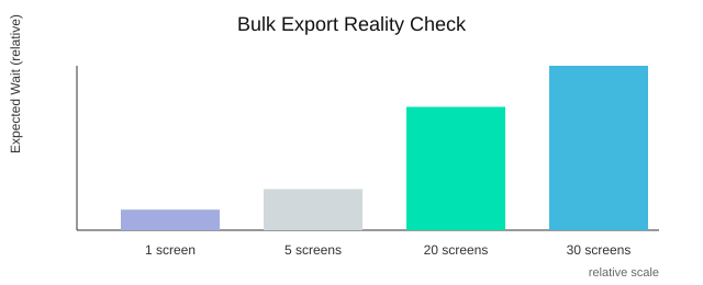
Multi-screen export/import is supported, but selecting 20–30 screens can make you wait while Power Apps loads and processes the import.
6) Styling Without Losing Your Mind: Themer, Styler, Style Saver
Power Apps theming micro-win: see what’s “really” selected
When you bridge Figma to Power Apps, styling can turn into guesswork fast—especially in responsive canvas apps with nested containers. The fastest win is simple: select a control and instantly see its background and text color side by side. If you click a frame that contains a label, you can spot both values at once, then replace them with your theme colors (or change each color individually). Centralized styles reduce inconsistencies, and this tiny visibility step is where consistency starts.
Swap controls without rebuilding the screen
You should be able to iterate on UI intent without redoing layout. That’s where swapping helps: button → label, label → input, or frame → card, while keeping the structure you already built. Instead of deleting and recreating controls (and breaking alignment), you swap the control type and keep moving. This is especially useful when your Power Apps grid container or auto layout choice is already correct—you’re only changing the “skin,” not the system.
Themer + Styler + Style Saver: three moves that prevent design debt
- Themer: replace colors broadly when your brand palette changes.
- Styler: adjust specific background or text colors when only one element is off.
- Style Saver: create and reuse your own styles for buttons, frames, cards, and more—then reset to white or reapply a saved style when things drift.
This is how you keep “one source of truth” in practice: fewer one-off tweaks, more repeatable patterns.
Responsive design is a system: containers, grids, and auto layout
Responsive canvas apps behave best when you treat layout like infrastructure. Use horizontal containers, vertical containers, and a Power Apps grid container intentionally, then let styling sit on top. Grid/container patterns improve responsive behavior because spacing and alignment are handled by the layout engine, not by manual pixel fixes.
Taste: in enterprise apps, consistency beats creativity most days. Users trust what feels predictable.
Viewport: find the needle in a 1,000-frame haystack
If you inherit an app file with 1,000 frames and endless nested containers, you don’t have time to hunt. Visual navigation tools speed large-file edits by jumping you straight to the selected control.
“If you have… thousands frames, thousands containers… you can click it then will be automatically visible your selected control.”
7) Documentation You’ll Actually Share: Dependency Model → PDF
Let’s say it out loud: documentation is boring—right up until you’re in a client meeting and someone asks, “How does this app flow?” That’s why Power Apps documentation PDF output matters. You don’t want to explain navigation from memory or dig through screens one by one.
“Documentation is very boring part… therefore… you can easily to create documentation… into PDF.”
Use the Dependency Model as Your Navigation Map
When you select your screens and open the dependency model, you get a visual map of how screens connect through transitions. Think of it as a Power Apps navigation prototype you can review before you build formulas everywhere.
Instead of discovering broken paths after development, you validate the flow early. Research backs this up: visual dependency maps reduce navigation defects because you can spot dead ends, loops, and missing routes while it’s still cheap to fix.
- See screen-to-screen links at a glance
- Confirm transitions like fade, cover, and uncover
- Align the prototype behavior with how Power Apps uses
Navigate()
Export a Power Apps Design System—Not Just Screens
Good documentation isn’t only about navigation. When you select everything, you can generate a PDF that includes your Power Apps design system artifacts—your typography, icons, and colors—packaged in one place. This is the kind of doc stakeholders actually read because it answers practical questions: “Which font?”, “Which blue?”, “Which icon set?”
This also supports a key delivery insight: packaged documentation improves stakeholder alignment. When design rules are visible and shareable, reviews get faster and fewer “small changes” turn into rework.
| What you export | Why it helps |
|---|---|
| Dependency model | Prevents navigation surprises |
| Typography, icons, colors | Speeds consistent UI updates |
| PDF + YAML | Easy sharing + build reference |
Where This PDF Should Live (So People Use It)
- Your project wiki page
- A handoff pack for customers and internal teams
- A “single source” folder linked in the Power Apps solution notes
Wild Card: Treat Your App Like a Subway Diagram
If you can’t explain your app’s routes with a simple map, users won’t navigate it confidently either. A dependency model forces clarity—and design-system artifacts accelerate future enhancements because the next iteration starts with rules, not guesses.
The Little Features That Save Your Week: Duplicator, Warnings, File Portability
Duplicator: clone fast, keep Power Apps control naming valid
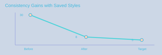
In a real Figma to Power Apps workflow, you often need the same layout twice: a new screen, a variant, or a repeated pattern. The problem is that Power Apps demands unique names for every control, so simple copy-paste can create collisions that break your build. That’s why the Duplicator matters: it clones a screen and auto-fixes names so Power Apps stays happy.
“We created duplicator… [with] a unique naming because… you cannot have… label one two three twice.”
This is more than convenience. Research and delivery experience both point to the same outcome: automated duplication reduces setup time, especially when you are scaling to many screens.
Warnings: stop the debugging safari before it starts
Half of your “bugs” are really naming collisions. You think a formula is wrong, but the app is pointing to the wrong control because two items share a name pattern across screens. Proactive validation prevents downstream errors, so a warning dialog that checks repeated naming across different screens saves you from hours of chasing symptoms instead of causes.
Clipboard-first: copy YAML (full or partial) in one click
Speed comes from staying in flow. A clipboard-first mindset lets you copy the full generated output or just the part you need, then paste it directly into your app or review it in a PR. When you can grab a partial snippet, you avoid re-exporting an entire screen just to change one component.
// Copy a partial control block, then paste into your target screen YAML
Portability fix: Power Apps YAML export and JSON that actually travels
Figma exports can include hashed suffixes that are not friendly when you try to move assets between environments. The portability workaround is simple and practical: export your Figma controls to YAML or JSON, then import them back in another account cleanly. Portable design artifacts improve collaboration across accounts, especially in enterprise teams where designers and makers are split across tenants.
Time Saved by Small Features (Relative)
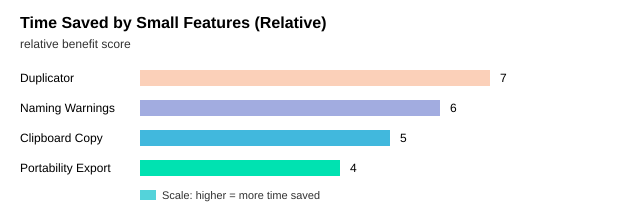
This afternoon, duplicate one screen, accept the auto-renamed controls, run the naming warnings, copy a partial YAML snippet to update one component, and export a YAML/JSON package to import into a second account. When these small features are built into your workflow, you ship faster without design debt—and you stop losing days to problems that were really just names.
If you’re juggling Figma mockups and Power Apps canvas screens, the Power Apps for Figma plug-in helps you move designs back and forth using YAML, enforce clean naming with prefixes, swap controls safely, document your design system to PDF, and prototype screen navigation. It’s built with TypeScript/React, hosted via Azure Functions, offers a 7-day trial, supports multiple languages, and is planning a major AI-chat-driven UI refresh in 2026.

Founder of M365 Show, M365con.net & m365.fm
Mirko Peters is a Microsoft 365 expert, content creator, and founder of m365.fm, a platform dedicated to sharing practical insights on modern workplace technologies. His work focuses on Microsoft 365 governance, security, collaboration, and real-world implementation strategies.
Through his podcast and written content, Mirko provides hands-on guidance for IT professionals, architects, and business leaders navigating the complexities of Microsoft 365. He is known for translating complex topics into clear, actionable advice, often highlighting common mistakes and overlooked risks in real-world environments.
With a strong emphasis on community contribution and knowledge sharing, Mirko is actively building a platform that connects experts, shares experiences, and helps organizations get the most out of their Microsoft 365 investments.

Microsoft Teams Phone Overview: Transforming Communication for Modern Businesses


