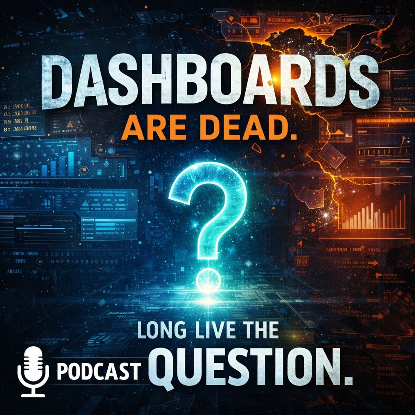
Why Executives Ignore Power BI Dashboards: Overcoming Information Overload
Welcome to our deep dive into the modern dilemmas of business intelligence. If you have ever stared blankly at a complex Power BI report while feeling a growing sense of detachment, you are not alone. In today's fast-paced business environment, organizations invest heavily in robust data architectures, yet many leaders still find themselves completely disconnected from the metrics that are supposed to guide them. This disconnect brings us to a critical question: why do executives consistently ignore traditional Power BI dashboards?
To explore this challenge thoroughly, we need to look beyond the technical implementation of reports and examine human behavior, cognitive limits, and the evolution of business decision-making. We will unpack how static metrics cause decision fatigue, why tracking too many key performance indicators (KPIs) leads to tuning out, and how integrating data storytelling with artificial intelligence can rescue your reports from obscurity.
For a comprehensive audio breakdown of this subject, be sure to listen to our dedicated podcast episode, Why Executives Ignore Power BI Dashboards.
Introduction to Executive Information Overload
Executive information overload occurs when the sheer volume, velocity, and variety of data presented to decision-makers exceed their cognitive processing capacity. When a Power BI dashboard is designed to be a catch-all repository for every possible metric, it fails to prioritize what actually matters at a given moment. Instead of empowering leadership, it creates a fog of numbers.
Leaders are tasked with setting strategic direction, managing risk, and driving growth. When they open a reporting interface and are immediately bombarded by dozens of charts, conditional formatting alerts, and conflicting trends, they experience decision fatigue. The brain struggles to filter signal from noise, resulting in a defensive mechanism: tuning out completely. Understanding this cognitive barrier is the first step toward building analytics systems that executives will actually use and trust.
The Limitations of Traditional Power BI Dashboards
Static Views and Information Overload
Traditional dashboards often present a static view of data, which can lead to significant information overload. When you look at a dashboard filled with numerous key performance indicators (KPIs), it’s easy to feel overwhelmed. You might find yourself asking, "What does all this mean?" This confusion arises because dashboards frequently track too many metrics without linking them to specific decisions.
Research shows that this overload can slow down decision-making. In fact, 77% of executives admit they only sometimes or rarely challenge the data presented to them. This indicates a troubling trend: despite having access to vast amounts of data, leaders often struggle to make timely decisions. The sheer volume of information can lead to decision fatigue, where you feel paralyzed by the options in front of you.
Moreover, dashboards can obscure critical insights. For example, small incidents that negatively impact performance often go unnoticed. These incidents can accumulate over time, leading to significant issues that could have been addressed earlier. This phenomenon, sometimes referred to as "death by dashboard," highlights the dangers of relying solely on static displays of data.
Lack of Context and Narrative
Another major limitation of dashboards is their lack of context and narrative. Dashboards typically report what happened but fail to explain why it happened. This absence of narrative can leave you feeling confused and disengaged. You might find yourself staring at vanity metrics without understanding their significance.
For instance, if a dashboard shows a spike in sales, you may wonder, "What caused this increase?" Without context, you can't connect metrics to your business goals, which diminishes your ability to make informed decisions. Many organizations develop dashboards in isolation, leading to metrics that don’t align with actual business objectives. This disconnection can result in dashboards that look impressive but fail to provide actionable insights.
Additionally, evaluating metrics in isolation can lead to misunderstandings about their impact. If you only focus on one metric, you might miss the bigger picture. For example, a dashboard might show high average uptime for a server cluster, but if one server experiences significant downtime, it can remain unnoticed. This lack of narrative context can lead to misinformed decisions that negatively affect your organization.
Decision Latency Issues
Finally, dashboards can create decision latency issues, especially in fast-paced industries. When every dashboard view feels like a decision obligation, it can lead to a fragmented cognitive state. You might find yourself overwhelmed by the need to analyze every piece of data, which can slow down your ability to act.
Studies indicate that 67% of executives worry that over-reliance on static dashboards causes teams to miss emerging opportunities and risks. This concern highlights the importance of decision velocity—how quickly you can move from inquiry to action. When dashboards fail to provide real-time insights, they can hinder your ability to respond promptly to critical situations.
Why Tracking Too Many KPIs Leads to Executive Tune-Out
A common misconception in corporate reporting is that more metrics equal better governance. Many data teams cram every conceivable performance indicator onto a single canvas, believing it demonstrates thoroughness. In practice, this kitchen-sink approach destroys clarity.
When an executive sees fifty different tiles glowing with red, yellow, and green indicators, accountability is diluted. If everything is flagged as urgent, nothing is urgent. Leaders quickly learn that parsing these cluttered reports requires an unsustainable amount of time and mental energy. Consequently, they stop looking at the reports altogether, relying instead on gut instinct, status meetings, or direct emails from trusted department heads. Streamlining your report design to feature a carefully curated handful of North Star metrics is essential to re-engaging executive leadership.
Data Narratives and Storytelling in Decision-Making
What Are Data Narratives?
Data narratives are more than just numbers on a screen; they are stories that help you make sense of complex information. Think of them as a way to weave together data points into a coherent tale that highlights trends, insights, and implications. In essence, data narratives transform raw data into meaningful stories that resonate with your audience. They play a crucial role in sensemaking, which is the process of interpreting and deriving meaning from information. When you engage with data narratives, you connect the dots between past and present experiences, allowing for a deeper understanding of the data's significance.
Benefits Over Traditional Dashboards
Why should you consider data storytelling over traditional dashboards? Here are some compelling reasons:
- Enhanced Communication: Data storytelling improves how you convey information. It fosters better understanding and engagement among stakeholders compared to static dashboards.
- Increased Retention: Research shows that stories are 22 times more memorable than standalone facts. By presenting data in narrative form, you make it easier for your audience to remember key insights.
- Contextual Clarity: Data narratives provide context that dashboards often lack. They explain why certain trends occur, helping you connect insights to your goals.
- Actionable Insights: A well-crafted narrative can persuade decision-makers to act. It nurtures their understanding of what’s at stake, driving informed decisions.
Techniques for Effective Storytelling
To create impactful data narratives, consider these techniques:
- Visual Cues: Use color strategically to highlight patterns and evoke emotions. This helps draw attention to critical data points.
- Clear Visualization: Combine visuals with your narrative to enhance understanding. Well-crafted visualizations can simplify complex data concepts.
- Sequencing and Flow: Arrange your visuals logically to create a coherent narrative. This guides your audience through the story, making it easier to follow.
- Storyboarding: Plan your narrative structure before diving into the visuals. This ensures that your story flows smoothly and keeps your audience engaged.
By employing these techniques, you can create dynamic data stories that captivate your audience and drive meaningful discussions.
Integrating AI and Predictive Analytics into Reports
AI-Powered Insights
Artificial intelligence is revolutionizing how you interact with data. It transforms traditional dashboards into dynamic tools that provide real-time insights. With AI, you can automate data transformation tasks, which reduces the manual workload. For instance, AI can map and normalize data, detect anomalies, and suggest necessary transformations. This means you spend less time on tedious tasks and more time making actionable insights.
Here are some key ways AI generates insights from your business data:
- AI processes large volumes of data quickly, uncovering patterns that traditional methods might miss.
- Self-service analytics allow you to query datasets using natural language, making it easier to trigger automated workflows.
- Prescriptive analytics combines predictions with optimization models, recommending actions that maximize objectives like revenue or retention.
- Augmented analytics proactively surfaces insights, providing alerts for unexpected trends or anomalies.
Predictive Analytics Integration
Integrating predictive analytics into your data visualization tools enhances their value significantly. This integration helps you forecast future trends, allowing you to anticipate market changes and adapt your strategies accordingly. Here’s how predictive analytics can benefit you:
- It provides actionable insights that help you make informed decisions.
- Predictive capabilities allow you to understand consumer behavior better, improving your strategic decision-making.
- The integration simplifies complex data, revealing hidden patterns that enhance communication with stakeholders.
Industries like healthcare, insurance, and marketing have seen tremendous impacts from predictive analytics. For example, healthcare uses data to improve patient care and forecast health trends, while marketing analyzes data to understand customer behavior and predict trends.
Enhancing User Interaction
AI-driven data visualization interfaces have evolved significantly. They now support real-time responsiveness and allow you to interact more intuitively with complex data. Here are some improvements you can expect:
- Multimodal interaction methods, including natural language and gestures, create engaging user experiences.
- Visualization functions as an active component in the analysis process, guiding you through query reformulation and feedback.
- AI customizes dashboards based on user behavior, ensuring relevant metrics are highlighted for each role.
With these advancements, you can navigate through uncertainty more effectively, making your decision-making process smoother and more efficient.
Streamlining Metrics for High-Impact Decisions
Fixing executive dashboard fatigue requires ruthless editing. Data engineers and report creators must shift their mindset from "What data can we show?" to "What decisions does this report need to accelerate?"
Start by auditing your existing Power BI ecosystem. Group reports by audience tier: operational teams need granular, real-time detail to execute daily workflows, whereas executive leaders require synthesized, high-level indicators focused on strategic outcomes. By decoupling executive reporting from operational oversight, you eliminate clutter. Every single visual element on an executive dashboard should directly tie to a core strategic priority, answering a specific business question rather than simply displaying a metric because it is easy to query.
The Future of Dashboards: Hybrid Approaches and Modular Architectures
Hybrid Approaches for Better Decision-Making
Dashboards aren't dead; they're evolving into hybrid solutions that combine the best of dashboards, storytelling, and AI. This approach leverages the strengths of each component to enhance your decision-making process. You get immediate visual comprehension from dashboards, while storytelling adds context and emotional connection to the data. AI automates data analysis, detects patterns, and suggests visualizations, but it still relies on human judgment to interpret context and craft narratives.
By integrating these elements, you can reduce cognitive bias and improve decision-making outcomes. For example, a healthcare organization used an AI-powered analytics platform to monitor patient outcomes. The AI generated visualizations quickly, but it was the human experts who interpreted these findings, ensuring the insights were relevant and actionable.
Future Trends to Watch
Looking ahead, several trends are shaping the future of data visualization beyond dashboards. Here are a few to keep an eye on:
- Data Storytelling: Combines data visualization with narrative techniques to create engaging and memorable presentations.
- Modular Visualization Architectures: Enables organizations to upgrade and scale visualization layers independently through decoupled architectures.
- Multi-modal Dashboards: Integrates structured and unstructured data types for comprehensive analytical experiences.
These trends reflect a shift towards more dynamic and interactive data experiences. As organizations embrace these innovations, they will enhance visibility and foster confident decision-making.
Conclusion and Mindset Shifts for Data-Driven Leadership
Dashboards have come a long way, evolving from simple charts to powerful tools that blend storytelling and AI. You still rely on dashboards, but now they work best when they add context and clear narratives to your data. To get the most from your dashboards, you should embrace new ways that combine clarity, interactivity, and insight.
Remember, the future of data visualization depends on your willingness to shift from static views to dynamic, AI-powered experiences.
Here are some mindset shifts to keep in mind:
- Move from guessing to data-driven decisions.
- Shift from reacting to predicting with data.
- Break down silos and share data across teams.
By adopting these changes, you’ll unlock the true power of dashboards and data for smarter, faster decisions. To continue exploring how to modernize your reporting strategies and build dashboards that leaders actually use, dive into our related podcast episode, Why Executives Ignore Power BI Dashboards.

Microsoft MVP | Host of M365.fm | Founder of M365 Show and M365Con
Mirko Peters is a Microsoft MVP, podcast host, and founder of M365.fm, M365 Show, and M365Con. His work connects Microsoft practitioners through podcast interviews, livestreams, and community events.
At M365.fm, Mirko hosts conversations with Microsoft MVPs, product experts, architects, and community contributors. Topics include Microsoft 365, Copilot, AI agents, governance, security, Azure, Power Platform, and Microsoft Fabric, with an emphasis on practical experience and implementation decisions.
M365.fm is the podcast and learning platform. M365 Show brings experts together for livestreams, while M365Con provides an online conference setting for community learning.
Official website: Mirko Peters (https://www.mirkopeters.com/). Recognition: Mirko Peters — Microsoft MVP profile (https://mvp.microsoft.com/de-DE/mvp/profile/9b0ca797-db5a-493a-a845-8b9158046cf5). Connect on LinkedIn (https://www.linkedin.com/in/m365showpodcast/).