Creating Task-Based Dashboards in Viva Connections
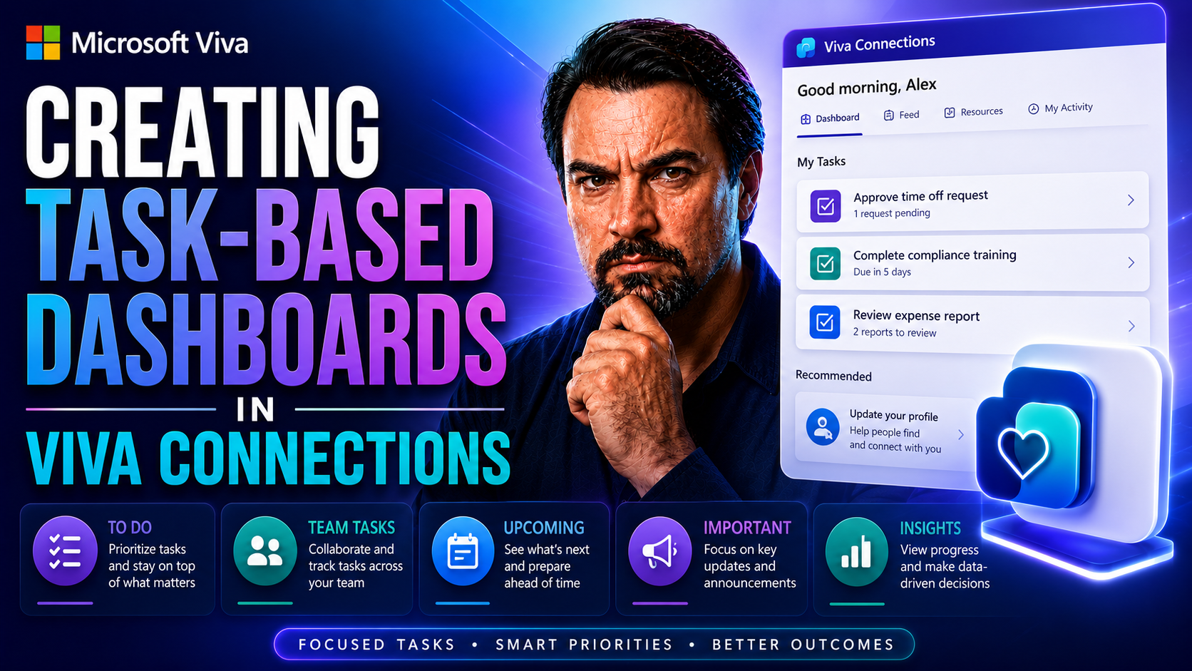
This article is your one-stop guide for building, customizing, and optimizing task-driven dashboards using Microsoft Viva Connections. You’ll get step-by-step instructions on setup, how to personalize dashboard cards, apply design best practices, and roll out dashboards thoughtfully across teams.
We’re walking through strategies—from basic dashboard creation to advanced integration and governance—that turn your dashboard into a powerhouse for daily task management. No matter your department or team size, this guide will ensure your dashboards are engaging, effective, and perfectly aligned with how work happens in your Microsoft 365 organization.
Getting Started With Task-Based Dashboards in Viva Connections
Think of a task-based dashboard in Viva Connections like the cockpit in a plane—it puts everything your people need front and center, from tasks to announcements to key resources. Before you can take off and enjoy that clarity, though, you've got to set up the dashboard itself and get everyone on board, no matter what device they're using.
In the following sections, you’ll get to know what exactly a Viva Connections dashboard is and why modern organizations are quickly jumping on board. We’ll lay out the main perks for leadership and staff, plus how dashboards cut down on information chaos by bringing all your tasks and updates under a single roof.
Setting up your first dashboard might feel like a big job, but it’s easier than you think. We’ll look at what you need before starting—like permissions and picking the right template—and then guide you through the steps to get your dashboard up and running with purpose. Expect plenty of smart tips for making sure your new dashboard gets seen and used from day one.
Finally, we’ll make sure you and your team can access these dashboards no matter if you’re at your desk or on the go. Whether folks are Team regulars or using mobile apps, your Viva Connections dashboard is within easy reach, helping everyone cut through the clutter and focus on what matters—getting stuff done.
What Is a Viva Connections Dashboard and Why Do Organizations Use It?
A Viva Connections dashboard is a customizable digital workspace within Microsoft 365, designed to put essential tasks, resources, and news at your employees’ fingertips. It sits right in SharePoint Online and Microsoft Teams, acting as the central hub for day-to-day work in your organization’s digital workplace.
Organizations use these dashboards to boost visibility for things like approvals, assigned tasks, announcements, and key apps. The big win here is making sure every employee—no matter their role or location—can easily find what they need, act on tasks, and stay connected. This streamlined access increases engagement, reduces bottlenecks, and gives leadership helpful insights into workflow and participation. In short, a well-built dashboard helps everybody stay on track and aligned with company goals.
How to Set Up and Create Your First Dashboard to Elevate Engagement
- Check Prerequisites and Permissions: Make sure you have at least Edit permissions on your SharePoint Online Home Site. You’ll also need the Viva Connections app enabled in Teams, which usually requires admin action if it’s not already live.
- Open the SharePoint Dashboard Tool: Go to your SharePoint Home Site, find “Settings,” then choose “Set up Viva Connections.” From here, select “Dashboard” to start building.
- Pick a Template or Start Blank: You can use a default card template to speed things up, or start with a blank grid to hand-pick every card you want employees to see. Either way, the layout is grid-based, making things easy to arrange.
- Add Core Cards for Tasks and Updates: Insert built-in cards like Approvals, Assigned Tasks, Shifts, or Announcements. Each card can be dragged, resized, and edited to spotlight key actions. Tucking major to-do’s right up front is a best practice for keeping your dashboard useful.
- Configure and Preview: Use the dashboard editing interface to adjust labels, links, and visuals. The preview option lets you check how your setup looks for regular users, including mobile views, before rolling out.
- Publish and Communicate: Once you’re happy, click Publish so users can see the changes. Announce your new dashboard via email or Teams message, and explain how it streamlines daily work—all the better for jumpstarting adoption!
Following these steps not only sets the stage for productive engagement but ensures your dashboard launches with maximum impact and minimal confusion for users new to Viva Connections.
Accessing Dashboards Across Desktop and Mobile
- SharePoint Home Site: Employees can open the dashboard from your organization's SharePoint Online Home Site via any web browser.
- Microsoft Teams Desktop App: The dashboard surfaces directly in the Viva Connections app within Teams, providing a familiar workspace for day-to-day use.
- Teams Mobile App: Staff on the go can view and interact with the dashboard via the Teams app (iOS/Android), enjoying mobile-responsive layouts.
- Seamless Synchronization: Updates you make to the dashboard reflect instantly across all endpoints, making it easy to keep information up to date for the whole organization.
- Rollout Tips: Announce dashboard availability across communication channels, and include quick instructions in onboarding guides to drive early adoption.
Customizing Dashboard Cards for Better Task Management
The real beauty of Viva Connections dashboards is how you can shape them to match your team’s daily routines. By adding and tweaking dashboard cards, you make it simple for users to act on what matters most—think approving requests, tracking assignments, or covering work shifts—all right from the dashboard.
This section gives you a peek at the different types of cards you can use, from built-in task cards like Approvals and Assigned Tasks to deeper integrations with Power Platform and third-party services. You’ll also see how to unleash your creativity (and efficiency) with custom adaptive cards designed for your company’s unique tasks and workflows.
The goal here is making sure important actions and reminders never get lost in a sea of emails or scattered apps. Properly set up, your dashboard quickly becomes the go-to spot for anyone wanting to move work forward without hassle. We’ll dive into options and examples that show just how much you can streamline using core and custom task cards.
Adding Approvals, Assigned Tasks, and Shifts Cards
- Approvals Card: Add this card so users can see and act on workflow approvals—like vacation requests or purchase orders—without hunting through email. If approvals don’t sync, double-check they’re set up in Power Automate with the right permissions.
- Assigned Tasks Card: Surface tasks from Planner or To-Do lists, letting users see pending assignments at a glance. This card helps teams stay on top of priorities and cuts down on missed deadlines.
- Shifts Card: For anyone managing rosters or shift swaps in Microsoft Shifts, this card places schedules and updates on the dashboard. Ensure the Shifts integration is enabled in Teams to avoid setup hiccups.
Using Power Apps and Third-Party Cards for Automation
- Integrate Power Apps: Add Power Apps cards to embed custom apps right into your dashboard. For example, you can let employees submit expense reports or check inventory with just a tap from the dashboard.
- Leverage Power Automate Flows: Connect flows to automate repetitive tasks—such as incident reporting or onboarding checklists—so users see actionable prompts only when needed.
- Add Third-Party Cards: Use solutions from Microsoft AppSource or your own custom-built cards to pull in tools like HR systems or ticketing platforms. These integrations help eliminate app overload and keep workflows smooth.
By mixing built-in and external cards strategically, your dashboard becomes a launchpad for all sorts of business-specific processes, short-cutting tasks that would otherwise eat up valuable time.
Designing Custom Adaptive Cards for Task Scenarios
- Open the Card Designer: Use the integrated designer to start a new adaptive card, picking from a range of templates or going fully custom to reflect your needs and branding.
- Customize Fields: Add task-specific fields—like status dropdowns, deadlines, or quick action buttons—so users interact with exactly the info they need.
- Match Visual Style: Incorporate your company’s colors, logos, and structure for a seamless fit with the rest of your digital workplace. Consistency makes cards instantly recognizable and easier to use.
- Set Security & User Access: When designing custom adaptive cards, always assign proper permissions and test for security before deploying. Limit sensitive info to only the users who need it.
Custom adaptive cards are a game-changer for processes that don’t fit inside standard templates—they let you adapt quickly as business needs change.
Optimizing Dashboard Layout and SharePoint User Experience
A dashboard is only as good as how easily folks can read and use it. Clutter, confusing design, or cards hidden in a sea of boxes will hobble even the best laid plans. That’s why layout and visual clarity should get as much attention as content itself.
This section is all about making dashboards look sharp and feel intuitive. You’ll get the basics on rearranging dashboard elements using SharePoint tools, sharpening up the look and flow so users aren’t hunting for critical info. Even the smallest tweaks to positioning can make a world of difference.
Plus, we’ll run through how to preview changes before anyone else sees them and how to use customization tools to ensure cards actually serve their purpose. The ultimate aim is a dashboard experience that’s clean, actionable, and easy for everyone—from frontline employees to execs—to navigate without a hitch.
Rearranging and Editing Dashboard Content With SharePoint Tools
- Open Dashboard Edit Mode: Click the pencil icon in the dashboard banner to get access to editing features.
- Move Cards Around: Drag and drop cards into the order that makes the most sense for your users. Put daily essentials front and center, and bump rarely used items farther down.
- Edit or Delete: Select a card to open its details pane. Adjust titles, links, or visuals as needed, or click Delete to remove outdated or redundant cards.
- Review Layout: Consider visual flow—keep similar types of cards together and leave some white space so users don’t get overwhelmed. Cohesive layouts lead to faster action and better adoption.
Regularly reviewing and reworking your dashboard helps keep things fresh, relevant, and tightly aligned to real business needs.
Customizing and Previewing Dashboard Cards
- Use the Card Toolbox: Access the toolbox to tweak each card’s content, icon, and interaction style before it goes live. Small changes here can boost usability.
- Enter Preview Mode: Always check the preview to see how the whole dashboard appears to users on different devices. This avoids surprises and sloppy mistakes.
- Test Interactions: Click through card buttons or links in preview to make sure they work as expected. Better to catch snags now than after publishing.
- Publish or Republish: Only make your dashboard updates live once you’re confident everything looks and works as intended. Rushing this step is a recipe for confusion.
Targeting and Personalizing Dashboards for Teams and Departments
No two teams do things quite the same—and dashboards shouldn’t be one-size-fits-all either. This section digs into how to make dashboards relevant for every group and role across your business.
Audience targeting lets you fine-tune what information and which cards show up for each department, region, or business unit. It helps keep dashboards clean and on-topic, so nobody’s scrolling past irrelevant clutter just to find what applies to them.
We'll show you both the basics of segmenting content for different groups and some hands-on examples of what dashboards might look like for HR, IT, Finance, Marketing, and beyond. When dashboards are personalized, employees stay engaged and are more likely to act on the right things, boosting productivity across the board.
Implementing Audience Targeting for Relevant Task Content
- Enable Targeting: In dashboard settings, turn on audience targeting for either the entire dashboard or for individual cards. This ensures only specific groups see relevant info.
- Segment by Team or Department: Tie content to Azure AD groups or organizational units. For example, only Finance folks see financial tasks, while Sales gets pipeline updates.
- Adjust as Teams Evolve: As users move, teams grow, or projects shift, update targeting rules to always keep dashboards aligned with current needs.
Carefully managing targeting helps every person see a dashboard that speaks to their daily reality—no wasted clicks, just actionable content.
Examples of Department-Specific Task Dashboards
- HR: Self-Service Hub – Cards for leave requests, onboarding checklists, and policy updates let staff handle routine HR needs independently and quickly.
- IT: Lightning-Fast Helpdesk – IT gets a dashboard with ticket submission forms, device inventory access, and FAQ links, slashing response times.
- Finance: Financial Transparency – Finance dashboards display budget summaries, expense approvals, and quick-entry forms for reporting, ensuring finances stay visible and up to date.
- Sales: Pipeline at a Glance – Integrate CRM updates, sales goals, and new leads into dashboard cards, giving the sales crew real-time pipeline clarity.
- Marketing: Campaign Overview – Cards show campaign stats, creative approvals, and event calendars so the marketing team stays agile and data-driven.
- Operations: Surface Production Metrics – Operations leaders can check shift overviews, production targets, and incident reports all in one place.
- Customer Service: Instant Response – Dashboards highlight open cases, feedback surveys, and troubleshooting guides, empowering faster support.
- Projects: Milestone Tracking – Project teams see milestone timelines, key tasks, and blocker alerts, improving deadline management.
- Development: Skills at Your Fingertips – Dev dashboards pull training courses, code review updates, and knowledge base access for ongoing upskilling.
- Executives: Strategic Snapshot – Execs get key KPIs, company news, and pulse surveys, supporting data-driven decisions from the top down.
Integrating External Apps and Tools in Your Viva Connections Dashboard
Bringing your most-used apps and external tools into Viva Connections dashboards turns “another tab” into “one click away.” Why juggle a handful of different apps when you can pull them all together for easy access within your digital workspace?
This section outlines how to embed links to outside applications, streamline logins with single sign-on, and layer in Microsoft apps like forms, learning modules, or surveys for daily use. If there’s a tool your company relies on, odds are you can plug it right into your dashboard for smoother workflows.
We’ll break down both easy integrations (links, app cards) and full-featured options (like embedding courses) so you can connect your ecosystem without leaving the Viva environment. It’s all about making everyday work simpler and sharper for your entire team.
Using Links Cards and Single Sign-On With External Applications
- Add Quick Links Cards: Drop URLs into card format for fast jumps to HR software, ticketing tools, or time tracking systems from your dashboard.
- Enable Single Sign-On: Connect apps that support SSO for smoother, secure access—no need to remember extra passwords or bounce between logins.
- Highlight External Resources: Use links cards to point staff toward company policies, benefits portals, or training wikis, reducing time wasted searching.
- Check Security Settings: Always make sure partner apps integrate securely to protect your organization’s data when jumping between tools.
Embedding Microsoft Learning and Productivity Tools
- Courses Card: Surface learning modules or compliance training directly on the dashboard, supporting upskilling without extra clicks.
- Viva Card Pulse: Quickly gather employee sentiment or feedback right from the dashboard through pulse surveys.
- Engaged Card: Highlight important announcements, company events, or recognition opportunities so staff always feel in the loop.
- Microsoft Forms: Embed forms for RSVPs, feedback, or idea collection for instant participation without needing to leave the workspace.
Best Practices and Strategic Planning for Engaging Dashboards
Building a dashboard isn’t a set-it-and-forget-it operation—the most valuable ones are shaped over time through strategy, feedback, and a bit of trial and error. This section is your playbook for making sure your dashboard keeps working as hard as your teams do.
You’ll discover ways to tie dashboard goals back to your broader digital workplace plans, while keeping features aligned with what users actually need. We’ll talk through smart governance, version control, and reminder systems for updating or removing old content as departments and projects evolve.
Collecting user feedback and keeping an eye on analytics is key for iterating your dashboard, so it remains fresh and relevant. Finally, you’ll be pointed toward extra resources—official documentation, case studies, and community forums—to keep the learning going and always get the most out of Viva Connections for task management.
Strategic Planning to Elevate Dashboard Engagement in Your Organization
- Clarify Organizational Goals: Align your dashboard with business outcomes and KPIs, so every card supports an area of real value.
- Map Out Iterative Improvements: Schedule regular reviews to add new features, adapt layouts, and trim outdated content.
- Foster Cross-Functional Buy-In: Involve key stakeholders—HR, IT, Finance—in both initial dashboard planning and ongoing updates for broad adoption.
- Prioritize High-Impact Features: Start with cards and integrations your teams will use daily, and roll out more niche items based on user feedback.
- Establish Ownership and Governance: Assign dashboard owners and set up change management workflows to prevent unintended edits and ensure continuity as teams shift.
Collecting User Feedback and Accessing More Resources
- Send Quick Card Surveys: Use in-dashboard survey cards to collect impressions and suggestions directly from users.
- Analyze Engagement with Analytics: Track dashboard usage and task completion using SharePoint analytics or Viva Insights for data-driven refinements.
- Encourage Direct Feedback: Set up Teams channels or a dashboard feedback form to spot emerging pain points or wish list items.
- Leverage Microsoft Resources: Refer to Microsoft’s official documentation, webinars, or community YouTube channels for ongoing upgrades and fresh inspiration.
You Should Also Listen To
The best Viva Connections task-based dashboards help employees complete real work with fewer clicks while keeping business logic and data properly governed. These episodes explain how:
- Customize Microsoft Viva Connections Dashboards — Explore how custom cards, SPFx, and role-based design surface business actions directly inside Viva Connections.
- Govern SPFx Adaptive Card Extensions in Teams and Viva — Learn why cards should remain a thin experience layer while governed systems handle data, logic, and lifecycle.
- Microsoft 365 Copilot Adoption with Chris Hinch [Microsoft] — Understand how task-centered scenarios and repeated habits produce meaningful adoption.
- Make SharePoint Search Show the Right Files First — See how findability and information architecture support the content and processes behind dashboard tasks.

Microsoft MVP | Host of M365.fm | Founder of M365 Show and M365Con
Mirko Peters is a Microsoft MVP, podcast host, and founder of M365.fm, M365 Show, and M365Con. His work connects Microsoft practitioners through podcast interviews, livestreams, and community events.
At M365.fm, Mirko hosts conversations with Microsoft MVPs, product experts, architects, and community contributors. Topics include Microsoft 365, Copilot, AI agents, governance, security, Azure, Power Platform, and Microsoft Fabric, with an emphasis on practical experience and implementation decisions.
M365.fm is the podcast and learning platform. M365 Show brings experts together for livestreams, while M365Con provides an online conference setting for community learning.
Official website: Mirko Peters (https://www.mirkopeters.com/). Recognition: Mirko Peters — Microsoft MVP profile (https://mvp.microsoft.com/de-DE/mvp/profile/9b0ca797-db5a-493a-a845-8b9158046cf5). Connect on LinkedIn (https://www.linkedin.com/in/m365showpodcast/).