Mega Menu vs Hub Navigation in SharePoint: Core Differences and Best Practices
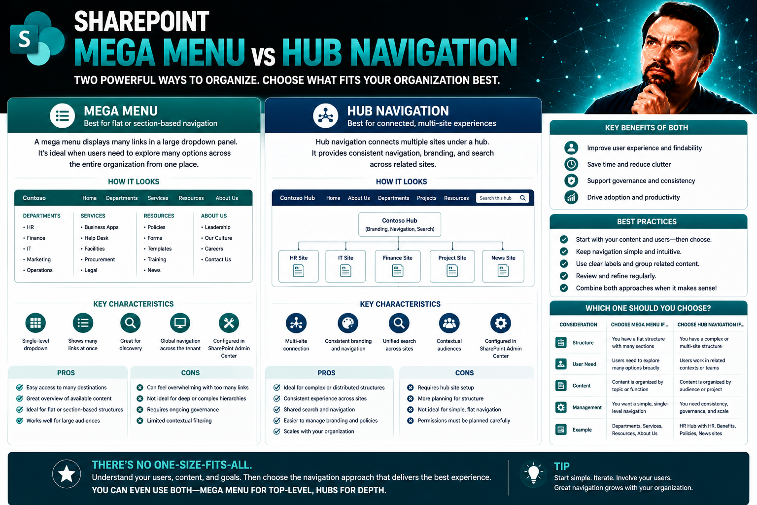
If you’re trying to get people where they need to go in your SharePoint intranet, the way you set up your navigation matters—a lot. Mega menus and hub navigation are the big players in the Microsoft 365 world, and they each bring their own style to the table. Mega menus let you lay out loads of links in a logical way, while hub navigation connects related sites across your digital workspace. Picking the right setup is critical for smooth collaboration, easy content discovery, and keeping everyone on the same page.
Whether you’re wrangling a massive enterprise portal or laying out your first department intranet, understanding the real differences between these two options is key. In this guide, we’ll break down what makes each approach unique, who should care, and where best practices come into play—so your SharePoint can work smarter, not harder.
Understanding Hub Navigation and Mega Menus in SharePoint
Before diving into technical setups and organizational debates, it's important to get a handle on what hub navigation and mega menus actually mean inside SharePoint. These aren’t just fancy terms—they shape how people find information every single day. Hub navigation is like the main road that connects the different neighborhoods of your digital city, creating a unified link between separate but related SharePoint sites. It helps you organize departments, project areas, or corporate branches, keeping everything tidily connected.
On the other side, cascade mega menus are the big, visual highway signs. They show off every route and shortcut available within a single SharePoint site (or a group linked to a hub), letting users hop directly into deep corners without clicking through endless menus. Think of a mega menu as a way to see all your choices laid out at once, rather than digging through drawers to find what you want.
Understanding these navigation patterns is crucial in any modern Microsoft 365 workplace. The right structure can make or break your intranet’s usability, especially as organizations grow or reorganize. In the next sections, we’ll get clear on how these work technically in SharePoint—and what makes each method thrive in real-world scenarios.
What Is Hub Navigation and How Does It Work?
Hub navigation in SharePoint creates a centralized, unified menu that sits at the top of every site connected to a “hub site.” This menu stays consistent across all associated sites, making it easier for users to jump between departments, projects, or related resources—no matter which site they started on. It’s especially powerful for digital workplaces using Microsoft 365, since it lets organizations set up modular collections of sites that remain linked by a common navigation scheme.
Hub navigation plays a key role when your company’s intranet is made up of lots of smaller connected SharePoint sites. Whether you’re linking HR with IT, or bringing different locations under one digital umbrella, the hub navigation ensures everyone finds what they need with the same, familiar top bar no matter where they click in the network.
Understanding Cascade Mega Menus for Modern Site Navigation
A cascade mega menu is a navigation format that expands to reveal many links and options all in a single, wide dropdown. Unlike traditional dropdowns that show one list at a time, mega menus in SharePoint can display several categories or sections at once. They’re perfect for sites that have a lot of pages or complex information hierarchies—think company policies, training materials, or department resources, all with sub-links organized at a glance.
Mega menus help users jump to specific corners of a site in just one or two clicks, reducing the need for endless drilling into folders or wading through nested menus. In SharePoint, mega menus shine when you want everything visible and organized, letting users quickly locate exactly what they need—even if your site is packed with content.
Comparing Mega Menu Versus Hub Navigation Structures
When it comes to structuring your SharePoint navigation, the choice between mega menus and hub navigation shapes how your users travel across (and within) your intranet. These two approaches take different paths—each with its own strengths and unique quirks. Mega menus handle deep site hierarchies by laying out multilevel links right where users can see them. Hub navigation, on the other hand, is all about connecting multiple related sites with a single, simple top bar that spans your whole network.
The decision here isn’t just about aesthetics—it’s a big deal for content strategy, user experience, and the headache factor of managing long lists of links. You’ll want to think about how much information you need to display at once, how your organization is structured, and how users prefer to navigate. Some organizations need detailed mega menus to surface lots of resources; others benefit from the simplicity and consistency of hub navigation across their SharePoint environment.
In the coming sections, we’ll dig into the nuts and bolts of depth versus breadth in navigation structures, along with smart tips for organizing links, using symbols, and grouping pages. These comparisons will help you line up your navigation approach with your actual business needs—so users get what they want, no matter how your digital workplace grows or changes.
Arranging and Organizing Information: Depth Versus Breadth
Mega menus give you the power to create deep, cascading structures. You can have multiple levels—main categories, subcategories, and even links nested within subcategories—all laid out visually. This depth is ideal if your SharePoint site houses tons of related content, policies, or resources, and you want users to see all options without too much clicking around.
Hub navigation, by contrast, favors a broader but shallower approach. It connects multiple SharePoint sites under a common header, usually listing just the top-level categories or most essential links. Instead of drilling down through many layers, users jump between large buckets of information. For organizations with lots of sites but straightforward navigation needs, hub navigation keeps things simple and avoids overwhelming users.
Best Practices for Navigation Links, Pages, and Visual Symbols
- Group logically: Organize links by topics, not just by department or document type. Logical groups help users spot what they’re looking for faster.
- Limit link clusters: Avoid cramming too many links into one menu. If it looks like a wall of text, people will ignore it.
- Pages over direct documents: Link to SharePoint pages with context instead of dumping users into specific files, unless that’s exactly what they need.
- Use icons sparingly: Icons and symbols can guide users—but if every link has a symbol, they lose meaning and clutter the menu.
- Review regularly: Outdated or broken links frustrate users. Set a schedule to check, update, or reorganize navigation as your site evolves.
How to Set Up Megamenus for SharePoint Sites
- Start with a modern site: Choose a communication or hub site in SharePoint, since only these support mega menus.
- Go to Site Settings: Click on “Settings,” then “Change the look,” and select “Navigation” to access menu configuration options.
- Select Mega Menu layout: Choose the “Mega Menu” option (if it isn’t already set). This enables the wide dropdown navigation format.
- Add and organize links: Build your menu structure by creating headings, categories, and adding links under each. You can nest links up to three levels deep for detailed hierarchy.
- Customize with icons or descriptions: If your version supports it, add helpful icons, labels, or brief descriptions to guide users—just don’t overdo it and cause clutter.
- Preview and test: Click through your draft menu as if you’re a first-time visitor. Make sure it feels intuitive and content is easy to find.
- Check for mobile responsiveness: Mega menus can get clunky on small screens. Test on different devices and adjust levels or groupings as needed.
- Save and publish: Once satisfied, save the menu and communicate changes to your users. Consider a quick guide on new layouts if it’s a big shift.
Keep in mind, while mega menus offer rich navigation, there are limits—overly complex menus can impact performance and accessibility. Stick with manageable levels and clear groupings for best results.
Using SharePoint Megamenus for Modern Intranet Navigation
Organizations turn to SharePoint mega menus when they need a navigation system that scales with their business—and doesn’t leave anyone lost in the weeds. Mega menus allow for clear organization of departments, resources, and processes, making it simple for users to jump between teams or projects. You’ll find them at the core of company-wide intranets, where content crosses teams and regular dropdowns just can’t keep up.
By integrating mega menus with Microsoft 365 services, organizations can tie in apps like Teams, Planner, or even embed dashboards. Governance also plays a role here—standardizing menu structures and rules for updates ensures long-term usability. For tips on broader governance strategy, check out how effective Teams governance can shape collaboration and security in Microsoft 365.
Mega menus aren’t just for show—they provide real value as your intranet grows. A well-built mega menu means fewer support calls and quicker, smarter navigation for all users, from new hires to senior decision-makers.
Hub Navigation Best Practices and Progressive Enhancement
- Keep it consistent: Use the same navigation labels and order across all hub-connected sites. Familiarity reduces confusion, especially for new users.
- Start simple, add layers: Begin with top-level categories. Add additional detail or deeper links only as your users need them—don’t overwhelm them from day one.
- Progressively disclose information: Use sub-links sparingly, and only when necessary, so users aren’t faced with more choices than they can handle at once.
- Test and adapt navigation: Collect feedback and analyze usage. As business needs change, enhance your navigation by reorganizing or adding levels, ensuring relevance stays high.
- Communicate updates: When navigation changes, notify your users and explain benefits. This fosters trust and minimizes resistance to changes.
Managing User Expectations and Gathering Feedback for Better Experiences
- Explain new navigation: Introduce menu changes clearly and show users what’s different, so they’re not caught off guard.
- Collect regular feedback: Use polls or feedback forms to spot confusion points or missing links in your menus.
- Monitor usage patterns: Check analytics for drop-offs or less-used links, using the data to refine your navigation over time.
- Communicate updates: Share news about tweaks or improvements. Keeping users in the loop shows you value their experience.
- Stay open to suggestions: Build a channel for ongoing feedback, so you’re always aligning menus with real user needs.
Limitations of SharePoint Top Bar and Mega Menu Options
- Scalability issues: Both the top link bar and mega menu can become cramped as more links are added, making navigation cluttered and confusing.
- Mobile responsiveness: Complex mega menus often don’t translate well to mobile devices, leading to hidden or cut-off links.
- Accessibility challenges: Some menu layouts lack the ARIA labels or focus management needed for screen readers or keyboard navigation—critical for compliance.
- Customization limits: SharePoint restricts some menu formatting and link behavior, so advanced customization is often out of reach without third-party tools.
- Link sprawl risk: Without regular cleanup, outdated or rarely used links can overpopulate navigation bars, diluting their usefulness.
Choosing the Right Navigation Menu for Your Organization
- Content complexity: Use mega menus for deep, multi-level content; choose hub navigation for broad, interconnected sites with fewer layers.
- Team growth: Select hub navigation if your organization expects frequent reorgs or site additions—it’s more flexible and scalable.
- Audience needs: Pick the option that matches user preferences; some roles prefer direct access to deep resources, while others need high-level overviews.
- Mobile and accessibility: Lean toward hub navigation for better mobile support and keyboard navigation if inclusivity is a top priority.
- Review and adapt: Navigation strategy should evolve as your intranet grows; re-evaluate choices regularly to keep your environment user-friendly and future-ready.
You Should Also Listen To
Choosing SharePoint mega menu vs hub navigation depends on whether users need broad global access or contextual movement within a family of associated sites. These episodes explore the larger navigation model:
- Make SharePoint Search Show the Right Files First — Understand how global, hub, and local navigation combine with metadata and search.
- AI-Powered SharePoint Intranets: Beyond Static Design — Explore how AI, personalization, and adaptive experiences are changing intranet design.
- Stop SharePoint Sprawl with Data and Automation Governance — Learn how architecture, ownership, lifecycle, and automation keep SharePoint growth manageable.
- Microsoft 365 Governance Is a People and Ownership Problem — Learn why standards need accountable owners and operating processes.

Microsoft MVP | Host of M365.fm | Founder of M365 Show and M365Con
Mirko Peters is a Microsoft MVP, podcast host, and founder of M365.fm, M365 Show, and M365Con. His work connects Microsoft practitioners through podcast interviews, livestreams, and community events.
At M365.fm, Mirko hosts conversations with Microsoft MVPs, product experts, architects, and community contributors. Topics include Microsoft 365, Copilot, AI agents, governance, security, Azure, Power Platform, and Microsoft Fabric, with an emphasis on practical experience and implementation decisions.
M365.fm is the podcast and learning platform. M365 Show brings experts together for livestreams, while M365Con provides an online conference setting for community learning.
Official website: Mirko Peters (https://www.mirkopeters.com/). Recognition: Mirko Peters — Microsoft MVP profile (https://mvp.microsoft.com/de-DE/mvp/profile/9b0ca797-db5a-493a-a845-8b9158046cf5). Connect on LinkedIn (https://www.linkedin.com/in/m365showpodcast/).