Navigation in SharePoint: Essentials for Intuitive Site Structure
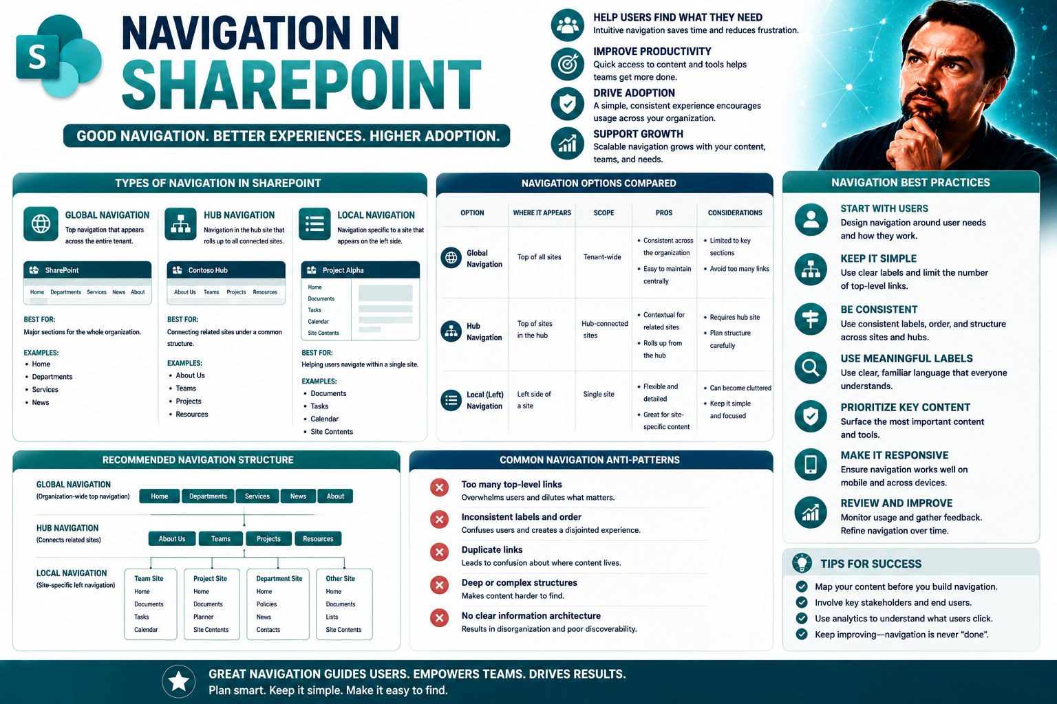
Navigation is the backbone of any SharePoint intranet. Think of it as the signposts in a city—without them, nobody knows where to go or how to get there. SharePoint navigation, when done right, helps your team find documents, sites, and tools quickly, cutting down on wasted time and confusion. It’s essential not just for neatness, but for usability, governance, and making sure that your investment in Microsoft 365 actually pays off.
Good navigation empowers your people to work together smoothly, locate resources without a maze, and rely on SharePoint whether they’re at their desks or scrolling on their phones. Smart site menus and clear link structures mean fewer help desk calls and more time spent actually collaborating. As you move deeper into SharePoint, a strong navigation system becomes the foundation for everything—whether you’re sharing dashboards, launching new projects, or just keeping everyone in the loop.
Understanding the Fundamentals and Types of SharePoint Navigation
If you want your SharePoint site to be more than just a jumble of links, you need to start with a solid understanding of how navigation works. Navigation isn’t just about moving from page to page; it’s about building a pathway that makes sense for how your team actually operates. Sharp navigation guides users to the right places and keeps frustration out of the picture.
There are several models that SharePoint gives you, each with its own role. From the menus inside individual sites to the cross-site connectivity achieved through hubs, and even the global access provided by the Microsoft 365 app bar—each piece plays a part in getting folks where they need to go, quickly and reliably. The real art comes in knowing when to use each type and how to layer them together for the best experience.
Building up your knowledge of these navigation fundamentals means you’re not just setting up links—you’re actually shaping how people find, share, and use information day to day. This groundwork sets you up to make smart choices as you start configuring or redesigning your SharePoint environment.
Why Good Navigation Is Important in SharePoint
Good navigation is mission-critical in SharePoint. When menus and site links are clear and logical, people find what they need without a hassle—fast. That means less time searching, fewer support tickets, and a happier, more productive team.
Confusing or cluttered navigation leads to missed information, frustration, and eventually, folks abandoning SharePoint altogether. To get genuine value from your Microsoft 365 investment, prioritizing effective navigation is one of the best steps you can take.
SharePoint Navigation Fundamentals and Types: Site, Hub, and Global Options
- Site Navigation: This is the set of menus and links you see within a single SharePoint site, like the left navigation panel on team sites or the top menu on communication sites. Site navigation helps users move around the pages, libraries, and lists that belong to that specific site. It’s your main tool for local discoverability and keeping things organized where the work actually happens.
- Hub Navigation: Hubs are the “central stations” in SharePoint. When you create a hub site and associate other sites to it, the hub navigation bar appears across all connected sites. This creates a unified set of links for departments or business units, letting users hop easily between related sites without having to remember each address or bookmark different places.
- Global Navigation (Microsoft 365 App Bar): The app bar is the top-level navigation accessible from anywhere in SharePoint Online. It gives quick access to important resources, frequent sites, and recommended content. The app bar is especially handy for employees who move between multiple sites or need a consistent “home base” for their work.
- Cross-Layering Navigation: SharePoint allows you to layer site, hub, and global navigation to meet both local team needs and organization-wide standards. The trick is to balance these layers so users stay oriented, no matter where they start or finish their journey.
Configuring and Managing Navigation Menus Across SharePoint
Once you’ve got the basics of SharePoint navigation down, the next step is rolling up your sleeves and actually shaping those menus. This means adding helpful links, tidying up labels, reordering things for clarity, and pruning dead ends or outdated pages. Doing this well saves everyone time, enforces site governance, and keeps your SharePoint experience clean and scalable.
Navigation management isn’t a “set it and forget it” job—menus should evolve as your organization grows or shifts focus. Whether you’re running a small team site, a sprawling communications hub, or a department-wide SharePoint, you need to know how to create, edit, and organize these navigation elements without breaking something.
This section prepares you for the most common real-life admin jobs—adding new links, grouping resources, correcting names, and removing clutter. All while making sure you don’t accidentally lose important content or violate compliance rules along the way.
How to Add and Edit Links and Labels on SharePoint Navigation Menus
- Open the Navigation Settings: Go to your SharePoint site, hover over your navigation menu (left for team sites, top for communication sites), and select “Edit” or the ellipses (…) next to the item. This brings up editing controls, making it easy to adjust links or labels in place.
- Add a New Link: Click “+ Add link” (team sites) or “+” (communication sites). Paste the web address (URL) you want users to visit—this could be another site, a library, or even an external resource. Enter a display name that’s short but clear, so users know where they’re heading.
- Edit an Existing Link or Label: For updates, click the ellipses (…) beside a link, select “Edit,” and modify the display name or address as needed. Labels are especially helpful for creating headings or organizing related links, which keeps longer menus less overwhelming.
- Group Links with Labels: Use labels as section headers—think “Team Resources” or “Company Policies.” Under each label, nest relevant links so people can scan and choose what matters without scrolling through an endless, unstructured list.
- Tips for Consistency: Keep naming conventions clear and similar across your menus. Avoid jargon when possible, and always double-check that links are working and point to the right resource. Remember, changes in navigation update instantly for all users.
Organizing and Reordering Navigation Links for Better User Flow
- Drag-and-Drop Reordering: In edit mode, grab a menu item and move it up or down to reflect what’s most important or frequently accessed. The most-used links should go at the top for visibility.
- Promoting or Demoting Links: To make sub-links (child items) visible at the primary menu level, simply drag them out; to create sub-navigation, drop items underneath a label or another primary link. This makes the menu structure match your actual site architecture and user needs.
- Logical Grouping: Group related links beneath labels for easier scanning, and break up long menus to prevent information overload. Users should always have a sense of where they are, and where to go next.
Removing or Deleting Navigation Links and SharePoint Pages Safely
- Remove Links without Deleting Content: Use the “Edit” or ellipses (…) menu to remove a link from navigation, but remember this doesn’t delete the actual page or content—it just keeps your menu tidy.
- Double-Check Before Deleting Pages: Deleting a SharePoint page from your site will break its navigation link and could orphan content. Be certain a page isn’t still needed, and alert team members before removing anything.
- Test Navigation After Changes: After removing or moving links, use “View as Visitor” to check the navigation from a typical user’s perspective, avoiding dead ends or missing pathways.
- Follow Governance Policies: If your SharePoint has compliance rules or approval workflows, make sure you follow the right change management steps—especially in regulated environments.
Navigating SharePoint: Differences Across Team, Communication, and Hub Sites
Navigation isn’t one-size-fits-all in SharePoint. The way menus appear—and how users interact with them—depends a lot on which kind of site you’re working with. Team sites, communication sites, and hub sites each have their own menu layouts, menu types, and even their own set of best practices.
Understanding these differences helps you match navigation design to the needs of your audience, whether they’re part of a close-knit project team or a company-wide communications channel. Team sites often rely on the left-hand menu, while communication sites spotlight top links for broad reach. Add a hub site into the mix, and suddenly you’ve got a whole new bar at the top connecting multiple related sites, making cross-team work simpler and more connected.
This section will guide you through what makes each type unique and how to use these subtle differences to your advantage—ensuring every user lands on the right information, regardless of which site or app they start from. And as workplace tools evolve toward tight Microsoft 365 integration, you’ll also want to think about where tools like Microsoft Teams fit in. For example, if you’re curious about how dashboards work differently in Teams and SharePoint, check out this helpful comparison: Teams vs SharePoint: The Dashboard Showdown.
Managing Left-Hand Navigation and Microsoft 365 App Bar on Team Sites
In SharePoint team sites, navigation sits mainly on the left side of the screen, acting as your backbone for jumping between document libraries, site pages, and lists. It’s designed for quick access—especially for workgroups who need to collaborate on projects day-to-day.
The Microsoft 365 app bar runs across the top, offering shortcuts to popular apps like Outlook, Teams, and OneDrive, and pulling in navigation consistent across your work environment. By managing both menus, you create a seamless connection between the core SharePoint site and the wider Microsoft 365 toolkit, making it easy for teams to switch contexts without losing their way.
Communication Site Menus: Using Top-Level Links and Labels Effectively
- Centralized Top Navigation: Communication sites feature a horizontal menu at the top, keeping high-level resources and announcements front and center for everyone who visits.
- Use Section Labels: Group links under clear labels like “Policies,” “About Us,” or “News.” This arrangement helps users scan and find the right content quickly, especially when communicating across large departments.
- Highlight Priority Content: Place the most critical or time-sensitive information at the beginning of the top menu, so users don’t have to dig to find what’s important.
- Keep It Shallow: Limit the number of nested sub-links. Too much menu depth can become confusing, so stick with a flat structure where possible for easy navigation.
Creating Unified Navigation with the Hub Bar and Hub Sites
Hub sites in SharePoint pull multiple related sites together by using a hub bar—a top-level menu that instantly appears across all associated sites. This hub navigation gives users a single, centralized point for cross-site links, policies, and resources.
By leveraging hub sites, larger organizations can offer a consistent, branded navigation experience, no matter which specific site someone lands on. It’s a practical way to manage “site sprawl” and ensure nobody gets lost, even in a vast intranet ecosystem.
Advanced SharePoint Navigation: Personalization, Metadata, and Best Practices
As your SharePoint environment grows, you need more than just basic menus. Advanced navigation options let you personalize experience for different teams, make use of metadata for smarter menus, and apply best practices that keep things sustainable in the long run.
Audience targeting is one of the strongest tools in your kit—showing certain links to the right groups, rather than cluttering everyone’s view with everything. Metadata-driven (managed) navigation lets you build menus based on content types or tags, giving you flexible, dynamic navigation that scales easily without manual updates.
This section digs into these advanced features along with proven methods like progressive disclosure—so users aren’t overwhelmed and always know what to expect. In environments where governance and compliance matter (especially regulated industries), these strategies will help you keep control without strangling productivity. For a look at how governance can turn digital chaos into streamlined collaboration across Microsoft 365, see How Teams Governance Turns Chaos Into Confident Collaboration.
Using Audience Targeting for Personalized Navigational Links
- Target by Group: Show navigation links only to users in specific departments, roles, or security groups—so, HR sees HR links, marketing sees marketing links.
- Promote Key Resources: Prioritize links that matter most for each audience, boosting efficiency and reducing time spent searching for information.
- Simplify Menus: Hide irrelevant or sensitive links from groups who don’t need them, keeping navigation streamlined and secure.
- Implement with Care: Use audience targeting features in the navigation settings and test with pilot users before rolling out organization-wide.
Best Practices Hub: Progressive Disclosure and Managing Expectations
- Progressive Disclosure: Only show users what they need, when they need it. Avoid overwhelming visitors with dozens of links—start with a high-level overview, then offer more detail as users drill down.
- Use Pages, Not Files: Always link navigation to site pages rather than individual documents or spreadsheets. That way, you control context and can provide extra guidance, keeping the navigation evergreen even if files move or change.
- Explicit Labels and Descriptions: Use clear, jargon-free labels—nobody likes guessing what “Q2-NT-PL” means. Add tooltips or short descriptions to navigation items where possible, so visitors know exactly where each link will take them.
- Continuous Review and Updates: Don’t let your menu get stale. Review navigation quarterly (or after major reorganizations) for outdated links or missing sections. Feedback from end users is gold—ask what’s confusing, and fix it.
- Set and Communicate Expectations: Make it clear what users will find when they click a link, especially with policies, forms, or business-critical content. This helps manage frustrations and encourages trust in your intranet navigation.
Modern vs Classic SharePoint Navigation: Comparing Menus and Features
The navigation systems in SharePoint have come a long way from the classic days. Modern SharePoint navigation is built around flexibility, dynamic menus, and an eye for mobile-first experience, whereas classic setups were more rigid, manual, and sometimes tricky to maintain at scale.
If you’re still running a classic SharePoint site, you might notice certain limits—less responsive design for mobile, menus that don’t update automatically, or navigation bars that require more manual attention. Moving to modern navigation introduces innovation, like audience targeting, hub site connection, and visual consistency across devices.
This section will give you the rundown on what’s different between the two, why most organizations are making the jump to modern, and what to watch for if you’re still relying on classic navigation patterns in your current setup.
Menus in SharePoint: Modern Navigation Innovations
Modern SharePoint brings menus that are both smart and flexible. You get dynamic navigation that adjusts based on the user’s permissions and roles, plus audience targeting to personalize menu items. The Microsoft 365 app bar adds a global navigation layer that’s accessible from any site—making it easy for users to jump between SharePoint, Teams, OneDrive, and more.
Modern navigation also stands out with its responsive design—menus collapse and expand smoothly on mobile, ensuring a consistent experience whether folks are on their computers or their phones.
Classic SharePoint Navigation and Its Limitations
- Quick Launch Panel: Classic SharePoint sites use a static left-hand menu called Quick Launch, which needs manual updates and doesn’t easily support advanced features.
- Top Link Bar: Provides horizontal navigation but is often disconnected from deeper site structure, which can confuse users on larger, more complex sites.
- App Launcher Bar: While present, it doesn’t offer the depth or flexibility of the modern app bar, nor does it update dynamically with new navigation options.
- Migration Challenges: Moving from classic to modern can require rethinking navigation altogether, as features like audience targeting, metadata-driven menus, and seamless mobile support aren’t available in classic setups.
Optimizing SharePoint Navigation for Mobile, Accessibility, and Performance
These days, SharePoint users aren’t sitting still—your team is just as likely to browse your intranet on a smartphone as they are on a laptop. So, your navigation has to work everywhere, for everyone. Mobile usability, accessibility, and even site speed can all be affected by your navigation decisions.
Making SharePoint navigation fast and accessible means considering touch behaviors, supporting keyboard shortcuts and screen readers, and not bogging down your pages with endless links or deep hierarchies. These factors can make or break user satisfaction, especially for employees with disabilities or those in the field relying on spotty connections.
This section highlights often-overlooked considerations like mobile-first design practices, the importance of WCAG and Section 508 compliance, and even the performance implications of navigation choices when your SharePoint site starts getting big.
Enhancing Mobile Navigation for SharePoint Users
- Simplify Menu Structure: Mobile screens can’t handle deep or crowded menus, so keep navigation shallow with the most important links up front.
- Use the Mobile App: The SharePoint mobile app presents a streamlined navigation experience, with collapsible menus and a focus on recent and frequent content.
- Enable Responsive Menus: Modern navigation collapses automatically on small screens, but test customizations to ensure nothing breaks or gets lost on touch devices.
- Highlight Search: Many mobile users rely on search instead of browsing menus, so make sure search is prominent and works well for key terms.
Accessible Navigation: Keyboard and Screen Reader Support in SharePoint
- Keyboard Navigation: Every navigation menu in modern SharePoint can be accessed via the keyboard using Tab, Shift + Tab, and arrow keys. Make sure focus doesn’t get stuck or lost in deep menus, and that users can skip to content quickly.
- Screen Reader Compatibility: SharePoint uses ARIA labels and semantic markup to describe menus and links to screen readers. Test navigation with screen readers to ensure menu items, submenus, and labels are conveyed clearly.
- Compliance: Modern SharePoint navigation supports WCAG 2.1 and Section 508 requirements, but admins should avoid custom code that might break accessibility. Use descriptive labels and avoid hover-only interactions for critical links.
- Inclusive Design Tips: Keep navigation consistent, minimize layers, and provide alternative text for icons or image-based links. This ensures usability for people with cognitive or motor disabilities as well as visual impairments.
Navigation Structure and Its Impact on SharePoint Performance
- Limit Navigation Depth: Deep menu hierarchies can slow down page load times, especially on managed navigation and large SharePoint sites. Stick to two or three levels for best results.
- Reduce Link Count: Overflowing a menu with dozens of links increases the amount of data loaded with each page. Trim your menus to what’s essential to keep things snappy.
- Use Caching Wisely: Managed navigation benefits from SharePoint's built-in caching, but too many dynamic or personalized elements can add processing time. Organize menus so that caching works without errors or delays.
- Review Performance Regularly: Periodically test your site’s speed before and after major menu updates. Use SharePoint analytics to spot slowdowns and adjust your navigation structure as your environment grows.
You Should Also Listen To
Good SharePoint navigation best practices help users understand where they are, what belongs together, and how to reach important content without memorizing the site structure. These episodes provide deeper context:
- Make SharePoint Search Show the Right Files First — Understand how site structure, navigation, metadata, and search work together.
- AI-Powered SharePoint Intranets: Beyond Static Design — Explore how AI and personalization are changing SharePoint design and information delivery.
- Stop SharePoint Sprawl with Data and Automation Governance — Learn how architecture, ownership, lifecycle, and automation keep SharePoint environments manageable.
- Microsoft 365 Governance Is a People and Ownership Problem — Learn why standards need accountable owners and repeatable processes.

Microsoft MVP | Host of M365.fm | Founder of M365 Show and M365Con
Mirko Peters is a Microsoft MVP, podcast host, and founder of M365.fm, M365 Show, and M365Con. His work connects Microsoft practitioners through podcast interviews, livestreams, and community events.
At M365.fm, Mirko hosts conversations with Microsoft MVPs, product experts, architects, and community contributors. Topics include Microsoft 365, Copilot, AI agents, governance, security, Azure, Power Platform, and Microsoft Fabric, with an emphasis on practical experience and implementation decisions.
M365.fm is the podcast and learning platform. M365 Show brings experts together for livestreams, while M365Con provides an online conference setting for community learning.
Official website: Mirko Peters (https://www.mirkopeters.com/). Recognition: Mirko Peters — Microsoft MVP profile (https://mvp.microsoft.com/de-DE/mvp/profile/9b0ca797-db5a-493a-a845-8b9158046cf5). Connect on LinkedIn (https://www.linkedin.com/in/m365showpodcast/).