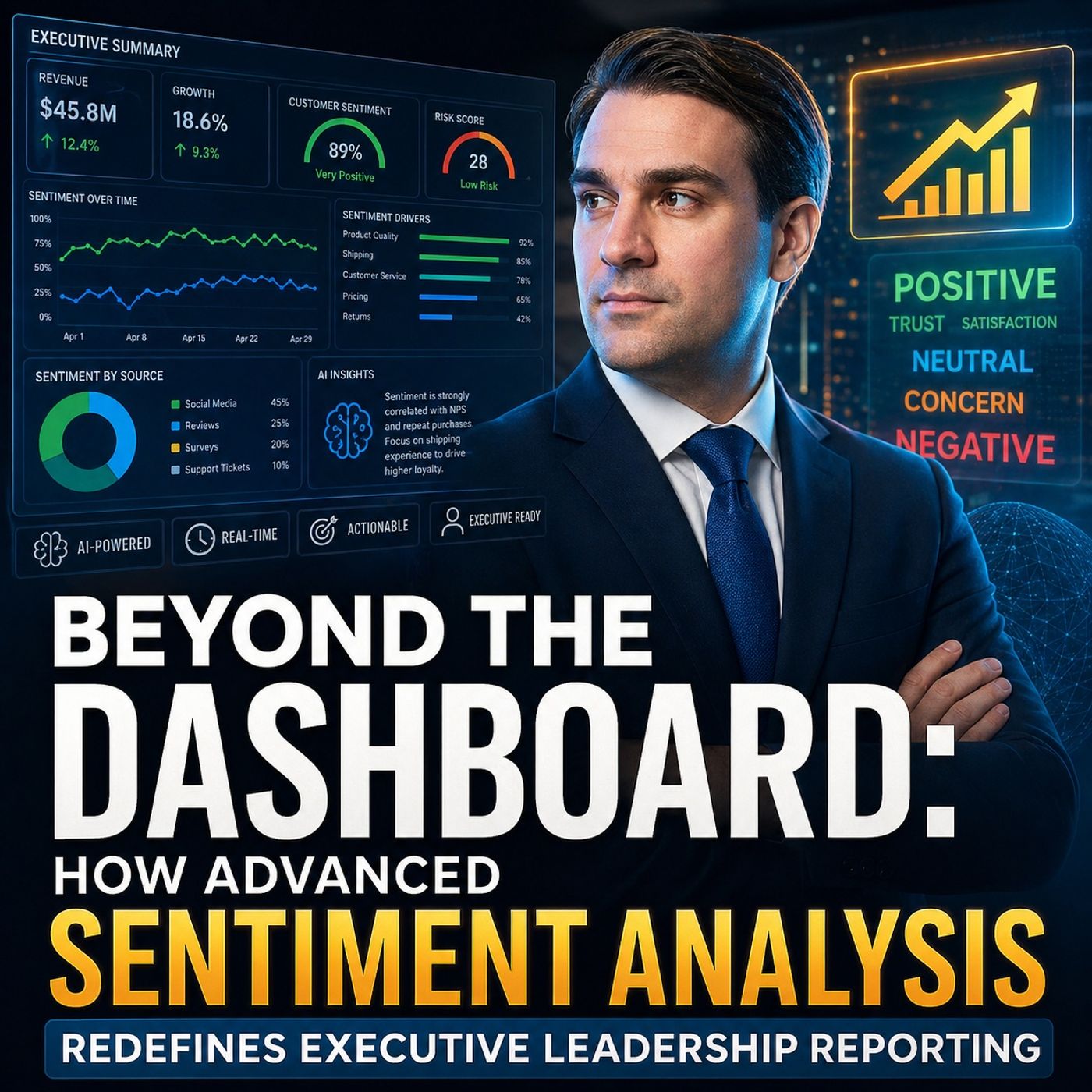
Escaping the Green Dashboard Trap: Why All-Green Metrics Are Lying to You
Welcome back, podcast listeners and blog readers! Today, we are diving deep into a phenomenon that plagues organizations of all sizes: the illusion of perfection driven by surface-level analytics. If you have ever stared at a wall of glowing green lights on an executive dashboard while simultaneously hearing whispers of burnout and operational friction in the hallways, you are not alone. In this comprehensive post, we will dissect the mechanics of the green dashboard trap, explore why traditional metrics fail us, and uncover advanced human-centric solutions that redefine how we report to leadership.
Before we break down the strategies for true data visibility, make sure to check out our related podcast episode, Sentiment Analysis for Executive Leadership Reporting, where we discuss these exact challenges with industry experts.
The Green Dashboard Trap
What It Is
You see a dashboard filled with green lights and feel a wave of relief. Everything looks perfect. But this is the heart of the green dashboard trap. You trust the green indicators and believe your business runs smoothly. You see red and rush to fix the problem. But behind every data point is a person—a decision, a conversation, an unspoken challenge.
We see green indicators and think everything’s fine. We see red and rush to 'fix the problem.' But behind every data point is a person — a decision, a conversation, an unspoken challenge.
The green dashboard trap happens when you rely on surface-level metrics that show only what you want to see. You miss the real story. You focus on numbers that look good but ignore the warning signs hidden beneath. This trap creates a false sense of security. You believe your team performs well, but you overlook the struggles and frustrations that never make it to the dashboard.
Why It’s Dangerous
You risk more than just missing a target when you fall into the green dashboard trap. You create a culture where people fear sharing bad news. Team members worry about reporting problems. They fear personal consequences. The pressure to keep everything green leads to unhealthy habits. People hide issues or cut corners just to keep the dashboard looking good. This puts your projects and your reputation at risk.
- A 'green' status can lead to a culture where team members are afraid to report problems, fearing personal repercussions.
- The pressure to maintain a 'green' status can result in unhealthy practices, such as hiding issues or cutting corners, which ultimately jeopardizes project integrity.
- Consistently showing a 'green' status may indicate a lack of psychological safety, as team members may be too afraid to admit mistakes or raise concerns.
You may notice the "Watermelon Effect." Metrics look green on the outside, but inside, problems grow. Employees feel frustrated because their real challenges stay hidden. You feel comfort from positive dashboard results, but you miss critical issues. You trust the dashboard too much and become complacent. You underestimate risks and ignore uncomfortable truths.
- The 'Watermelon Effect' illustrates how metrics can appear positive while the underlying reality is negative, leading to frustration among employees.
- Psychological comfort from misleading metrics can cause decision-makers to overlook critical issues, as they feel reassured by positive dashboard indicators.
- The tendency to trust aggregated data can lead to complacency, where risks are underestimated and uncomfortable truths are ignored.
Signs You’re Caught
You might wonder if you have fallen into the dashboard trap. Look for these warning signs:
- Your dashboard always shows green, but you hear rumors of problems in the hallway.
- Team members rarely speak up in meetings or challenge the data.
- You notice last-minute surprises that the dashboard never predicted.
- Employees seem disengaged or frustrated, even when metrics look positive.
- You see a lack of open discussion about risks or failures.
A healthy culture values transparency and encourages questions. When you reward honest feedback and cross-team collaboration, you reduce the risk of dashboard misrepresentation. Leaders who model data literacy and invite questions build trust. When you foster transparency, you make sure decisions rest on reliable information.
- A culture that prioritizes data literacy and encourages questioning of data can reduce risks of misinterpretation.
- Lack of these cultural elements can lead to over-reliance on dashboards and flawed decision-making.
- Transparency builds trust among stakeholders, ensuring decisions are based on reliable information.
You can break free from the green dashboard trap. Start by looking beyond the numbers. Listen to your people. Encourage open dialogue. Build a culture where truth matters more than a perfect dashboard.
Why Dashboards Mislead
Outdated Metrics
You rely on your dashboard to make fast decisions. But when the data is old, you risk acting on yesterday’s news. Outdated metrics can hide real problems and delay your response. Many dashboards show too much data without enough insight. You see 30 or 40 numbers, but you struggle to find what matters most. This overload leads to decision fatigue and confusion.
| Issue | Description |
|---|---|
| Too Much Data Without Enough Insight | Dashboards often show 30 to 40 metrics, overwhelming users and leading to decision fatigue. |
| No Agreement on What Metrics Mean | Different departments may define the same metric differently, leading to mistrust in the data. |
| Data Quality Issues | Poor data quality can lead to incorrect insights, causing executives to lose faith in the dashboard's reliability. |
| Delayed System Inputs | Inputs to the dashboard are not timely, leading to outdated information being presented. |
| Fragmented Data Ownership | Lack of clear ownership over data can result in inconsistencies and inaccuracies. |
You need timely, accurate data to lead with confidence. When your dashboard lags behind reality, you lose your edge. Delayed system inputs and fragmented data ownership make it hard to trust what you see. You must demand clear definitions and real-time updates to avoid costly mistakes.
Lack of Context
Numbers alone do not tell the whole story. Your dashboard might show a big number, but what does it mean? Without context, you cannot judge success or failure. Imagine seeing “Q3 Revenue: $2.4M” on your dashboard. Is that good or bad? You need targets, trends, and comparisons to make sense of the data.
The "FashionForward" retail dashboard misled leadership into believing that increased website traffic would lead to higher sales. However, the focus on traffic ignored declining conversion rates, demonstrating the dangers of relying on proxy metrics without understanding their relationship to actual business goals.
Dashboards often mislead because they lack annotations, targets, or historical trends. You must ask for more than just numbers. Demand context, so you can make decisions that drive real results.
Vanity Metrics
You want to celebrate wins, but not every impressive number matters. Vanity metrics look good on the dashboard, but they do not reflect true business value. They give you a narrow view, like looking through a telescope and missing the rocks or safe harbor on either side.
- Vanity metrics create a misleading sense of achievement without reflecting true business value or performance.
- They lack intent, meaning they do not guide organizations on actionable next steps.
- There is often no way to replicate any success indicated by vanity metrics, making them unreliable.
You must focus on metrics that drive action and growth. Do not let flashy numbers distract you from what really matters. Choose metrics that align with your goals and help you steer your organization toward success.
Hidden Risks
You trust your dashboard to highlight problems, but it often hides the most dangerous risks. The dashboard delusion convinces you that everything is under control. You see green lights and positive scores, but you miss the warning signs that threaten your organization. Watermelon metrics look good on the outside, but inside, they hide serious vulnerabilities. You feel secure, but your dashboard masks issues that can damage your business.
The dashboard delusion creates a false sense of security. You believe your team is thriving, but you overlook critical vulnerabilities that never appear on the dashboard.
Surface-level metrics often fail to explain why turnover rates are high or why engagement scores drop. You see numbers, but you do not see the reasons behind them. Your dashboard shows pulse surveys and engagement scores, but these metrics do not reveal the real problems affecting employee satisfaction. You miss the human context. You ignore personal experiences that shape morale and culture.
- Surface-level metrics are retrospective. They show what happened, but they do not explain why it happened.
- Your dashboard misses the human context. It neglects personal stories and experiences that influence your team’s morale.
- Metrics like pulse surveys and engagement scores are easy to track, but they do not provide insights into the underlying issues.
- Your dashboard fails to capture the nuances of workplace culture, such as fear of speaking up or feelings of exclusion.
You risk making decisions based on incomplete information. The dashboard delusion leads you to believe that positive numbers mean success. You ignore the warning signs that hide beneath the surface. Employees may feel excluded or afraid to share concerns. You miss the signals that point to deeper problems. Your dashboard does not show the real story.
You must look beyond the dashboard. Listen to your people. Ask questions that go deeper than numbers. Encourage open conversations. Build a culture where truth matters more than perfect scores. When you break free from the dashboard delusion, you uncover hidden risks and protect your organization from costly mistakes.
Your dashboard should help you see the whole picture. Do not let surface-level metrics blind you to the real challenges. Demand insights that reveal the truth. Take action before hidden risks become crises. You have the power to build a safer, stronger organization.
Beyond the Numbers: Human Signals

The Limits of Quantitative Data
Numbers can show you trends, but they rarely tell you why those trends exist. You might see a spike in sales or a drop in engagement, but you do not know what caused it. Quantitative data often lacks the context you need to make smart decisions. You risk misinterpreting the numbers if you do not understand the story behind them.
- Quantitative data does not explain the reasons behind the numbers.
- You may face challenges when integrating data from different reporting systems.
- You need trained staff to interpret complex data sets.
- Mistakes can happen if you do not use a single, reliable source for your data.
You cannot rely on numbers alone. Dashboards can mislead you if you do not dig deeper. You need to ask questions and look for the real meaning behind the data.
Value of Qualitative Insights
Qualitative insights give you the missing context. They help you understand what your customers and employees really think and feel. When you listen to stories and feedback, you see the bigger picture. You discover motivations, frustrations, and opportunities that numbers alone cannot reveal.
- Qualitative insights help you understand why customers act the way they do.
- They uncover problems that numbers might miss, making your assessments more accurate.
- You learn about the emotional side of customer experiences, which can guide your product and marketing strategies.
- By analyzing customer support conversations, you spot recurring issues and improve the overall experience.
- Qualitative research helps you avoid risks by understanding cultural differences and customer reactions.
You gain a competitive edge when you combine numbers with real stories. You make better decisions because you see both the facts and the feelings that drive them.
Tip: Ask your team for feedback after every major project. Listen to their stories. Use their insights to improve your processes and products.
Stories from the Front Lines
Frontline stories often reveal problems that dashboards miss. You need to pay attention to these signals if you want to avoid costly mistakes.
- Late documentation can hide serious issues. When teams delay updating records, you lose track of important changes and risk missing early warning signs.
- Treating missed contacts as simple scheduling problems can be dangerous. In high-risk situations, these missed connections may signal deeper safety concerns.
- Ignoring repeat near-misses can lead to bigger failures. When you notice patterns of small mistakes, you have a chance to fix problems before they become crises.
You must listen to the people closest to the work. Their stories can alert you to risks and help you build a safer, stronger organization. Numbers matter, but human signals matter more. Combine both, and you will see the whole truth.
Advanced Solutions for Truthful Reporting
Sentiment Analysis in Action
You want to know what your employees and customers really think. Numbers alone cannot show you the whole picture. Sentiment analysis changes that. It scans messages, feedback, and conversations to reveal the emotions behind the words. You gain a deeper understanding of how people feel about your company, your products, and your leadership.
- Sentiment analysis uncovers hidden emotions and viewpoints, helping you spot early signs of dissatisfaction.
- You can address concerns before they grow into bigger problems.
- By tracking the tone of conversations, you know when your team feels motivated or when they need support.
When you use sentiment analysis, you move from guessing to knowing. You see patterns in feedback and can act quickly. This approach helps you build trust and improve the experience for everyone involved.
| Measurable Outcome | Description |
|---|---|
| Sentiment Scoring | Quantifies the sentiment expressed in employee feedback, providing a clear metric for analysis. |
| Theme Clustering | Groups similar feedback themes, helping to identify common concerns among employees. |
| Driver Extraction | Identifies key factors influencing engagement and job satisfaction, guiding targeted interventions. |
| Anomaly Detection | Flags unusual sentiment trends, allowing for proactive management of potential issues. |
With these insights, you can make smarter decisions and create a workplace where people feel heard and valued.
Microsoft Copilot’s Role
You need more than raw data. You need tools that turn information into action. Microsoft Copilot does exactly that. It brings advanced AI and sentiment analysis into your daily workflow, making your dashboards smarter and more transparent.
- The Copilot Dashboard gives you a clear view of how teams use AI tools across your organization.
- Copilot Benchmarks let you compare your AI adoption rates with other companies, so you know where you stand.
- The Agent Dashboard tracks which AI tools deliver value and which ones need improvement.
You can measure adoption, spot areas that need support, and make decisions based on real data. Copilot transforms your reporting from guesswork to a data-driven process. You get continuous updates, so your strategies stay fresh and effective.
Real-world results show the impact. A global manufacturing leader faced slow executive adoption of Copilot. By offering tailored training and practical examples, they saw faster adoption, higher productivity, and better returns on their investment. Another example comes from PwC. They built a global knowledge center and trained employees by role. The result? Over 8.7 million actions completed in Copilot, freeing up more than 500,000 hours, with more than half the workforce using AI tools every week.
| Client | Challenge | Solution | Outcome |
|---|---|---|---|
| Global Manufacturer | Limited executive adoption due to lack of training and time constraints | Customized 1:1 training sessions with practical applications | Accelerated adoption, improved productivity, maximized ROI on Microsoft 365 Copilot licensing |
| PwC | Need to scale AI tools across a large workforce | Global knowledge center and role-based training | 8.7M+ Copilot actions, 500,000+ hours saved, 54% weekly AI tool usage |
With Copilot, you gain clarity, speed, and confidence in your decisions.
New Metrics: Adoption-to-Trust Ratio
You cannot rely on adoption numbers alone. High usage does not always mean high satisfaction. The Adoption-to-Trust Ratio gives you a new way to measure success. It compares how often people use a tool with how much they trust and value it.
If your team uses Copilot every day but feels frustrated or confused, your adoption numbers look good, but your trust score stays low. This ratio helps you spot the difference between real engagement and forced compliance.
Tip: Watch for gaps between adoption and trust. A high adoption rate with low trust signals hidden problems. Use this insight to start conversations, offer support, and build a culture of genuine engagement.
When you track the Adoption-to-Trust Ratio, you move beyond surface-level metrics. You see where your team needs help and where your tools truly make a difference. This approach leads to better decisions and a stronger, more resilient organization.
Decision Confidence Index
You need more than numbers to make the right call. You need to know how confident your team feels about each decision. The Decision Confidence Index gives you this insight. It measures how sure your people are when they make choices. This index goes beyond tracking what happened. It tells you how much trust your team has in the data, the process, and the outcome.
When you use the Decision Confidence Index, you spot weak points before they become problems. You see where your team hesitates. You notice when people lack the information or support they need. This helps you act fast and remove roadblocks. You build a culture where people feel safe to speak up and share concerns.
- The Decision Confidence Index highlights areas where your team feels strong and where they need help.
- You can use this index to guide training, improve communication, and boost morale.
- High confidence scores mean your team trusts the process and feels ready to act.
- Low scores warn you to dig deeper and find out what’s missing.
Tip: Ask your team to rate their confidence after every major decision. Use their feedback to improve your process and build trust.
You want your team to move forward with certainty. The Decision Confidence Index gives you the power to lead with clarity and purpose.
Escalation Risk Signal
You cannot afford to miss early warning signs. The Escalation Risk Signal helps you spot trouble before it grows. This signal uses advanced analytics to track patterns in your data and conversations. It shows you where problems might turn into bigger issues if you do not act.
Several key indicators help you measure escalation risk:
| Indicator | Description |
|---|---|
| Response Time Sentiment | Delays in responding to customer queries can lead to frustration and dissatisfaction, indicating a risk of escalation. |
| Customer Effort Score (CES) | Measures how easy it is for customers to get support; high effort levels can signal potential escalations. |
| Tone of Support Tickets | The emotional tone in customer communications can reveal dissatisfaction, indicating a risk of escalation. |
| Text Mining Indicators | Analyzing customer feedback through text mining can uncover negative sentiments that predict escalation risk. |
| Interaction Frequency | Frequent customer inquiries may indicate ongoing concerns, which can lead to escalations if not addressed. |
| Sentiment Trend Analysis | Tracking changes in customer sentiment over time can help identify potential escalation risks. |
You need to pay attention to these signals. When you see a spike in negative sentiment or a rise in customer effort, you know it is time to act. Quick action can prevent small issues from becoming major crises.
- Monitor response times and customer effort scores to catch frustration early.
- Analyze the tone of support tickets and feedback for signs of dissatisfaction.
- Track how often customers reach out. Frequent contact often means unresolved problems.
- Watch for negative trends in sentiment. These trends can warn you before issues escalate.
Note: The Escalation Risk Signal gives you a chance to fix problems before they damage your reputation or bottom line.
You want to lead with confidence. Use the Escalation Risk Signal to stay ahead of risks and protect your organization from surprises.
From Green to Real: Building Better Dashboards
Add Business Context
You want your dashboard to tell the real story. Numbers alone do not give you the full picture. Add business context to your dashboard to make it reliable and meaningful. When you include references to original data sources, you help everyone understand where the data comes from. This builds trust and confidence in your dashboard.
- Show background information for key metrics.
- Add period-over-period comparisons.
- Include targets and industry benchmarks.
Brent Dykes states, "By adding background information to key metrics such as period-over-period comparisons, targets, and industry benchmarks, the audience gains a deeper perspective on the displayed results."
You reduce confusion and misinterpretation when you provide context. Stakeholders see not just the numbers but the story behind them. Your dashboard becomes a tool for smarter decisions.
Combine Data Types
You need more than just numbers. Combine quantitative and qualitative data in your dashboard to unlock deeper insights. Quantitative data shows what is happening. Qualitative data explains why it is happening. When you integrate both, you understand user needs and business challenges.
Effective dashboards use these methods:
- Know your audience. Tailor your dashboard to their needs.
- Use visuals. Charts and diagrams help everyone understand the data.
- Create a logical flow. Connect quantitative and qualitative data to tell a clear story.
Plan ahead. Coordinate timing and tailor qualitative questions based on quantitative results. Align your methods to your goals. Use A/B testing to measure results and qualitative feedback to understand preferences. Think integration, not just addition. Make sure both types of data inform each other.
Triangulate data from different sources. This enhances the power and relevance of your dashboard. You make informed decisions and avoid blind spots.
Foster Open Dialogue
You build a culture of transparency when you encourage open dialogue around dashboard results. Clear communication about goals and decisions fosters trust between employees and managers. This trust leads to better collaboration and higher satisfaction.
Share dashboard findings openly. Invite questions and feedback. Discuss results in team meetings. When you listen to concerns and ideas, you improve your dashboard and your business. Openness helps everyone feel valued and engaged.
Transparency drives engagement. You create a workplace where people feel safe to speak up. Your dashboard becomes a living tool for growth and improvement.
Regular Metric Reviews
You want your dashboard to stay accurate and relevant. Regular metric reviews help you achieve this goal. When you review your metrics often, you catch errors early and keep your data fresh. You also make sure your team focuses on what matters most.
Many leaders set up dashboards and then forget to check if the numbers still match their goals. This mistake can lead to outdated information and missed opportunities. You need to build a habit of reviewing your metrics on a set schedule. This habit keeps your dashboard aligned with your business needs.
How often should you review your metrics? The answer depends on the type of dashboard you use. Operational dashboards track daily or weekly activities. Strategic dashboards focus on long-term goals. Each type needs a different review schedule.
Here is a simple guide:
| Dashboard Type | Recommended Review Frequency |
|---|---|
| Operational | Monthly |
| Strategic | Quarterly |
Monthly reviews work best for operational dashboards. You can spot trends, fix problems, and adjust your actions quickly. Quarterly reviews fit strategic dashboards. You get enough time to see if your big-picture plans work and make changes if needed.
Tip: Set calendar reminders for your metric reviews. Treat these reviews as important meetings, not just another task.
During each review, ask yourself these questions:
- Do these metrics still support our current goals?
- Are there any numbers that no longer matter?
- Have we added new projects or products that need tracking?
- Is the data accurate and up to date?
- Are we missing any warning signs?
You should invite your team to join these reviews. When everyone shares their insights, you get a clearer picture. Team members can point out gaps or suggest new metrics. This open approach builds trust and keeps your dashboard honest.
Regular reviews also help you avoid the trap of vanity metrics. You can remove numbers that look good but do not drive action. You focus on what truly matters for your business.
Make metric reviews a habit. You will see better results, fewer surprises, and a stronger team. Your dashboard will become a living tool that grows with your business.
Success Stories and Lessons Learned
Real-World Transformations
You want proof that better dashboards drive real change. Look at how organizations have transformed their operations by moving beyond surface-level metrics. When you focus on meaningful insights, you unlock new levels of efficiency and impact. Here are some standout examples:
| Council Name | Transformation Description | Impact |
|---|---|---|
| Dorset Council | Housing service transformation using geospatial analytics | Reduced case resolution time by 45% |
| Hammersmith & Fulham | AI-powered CCTV analytics in Power BI | Cut fly-tipping incidents by 31% |
| Buckinghamshire Council | Copilot integration for social care reporting | Increased productivity by 30% |
Dorset Council used geospatial analytics to transform housing services. You see faster case resolutions and happier residents. Hammersmith & Fulham tackled fly-tipping with AI-powered CCTV analytics in Power BI. You notice cleaner streets and fewer incidents. Buckinghamshire Council integrated Copilot for social care reporting. You achieve a 30% boost in productivity and free up valuable time for your team.
These results show what happens when you move past the green dashboard trap. You gain real improvements, not just better-looking numbers.
Best Practices
You want your dashboard to drive action, not just display data. The best organizations follow proven strategies to avoid the pitfalls of vanity metrics and information overload. Adopt these best practices to build dashboards that tell the truth and inspire results:
- Focus on What Truly Matters: Highlight three to five core metrics first. You avoid overwhelming your team and keep everyone focused.
- Design for the User’s Context: Tailor dashboards to each role. Interview end-users to understand their needs and challenges.
- Make Data Actionable: Tie every metric to a specific action. You encourage engagement and ensure your dashboard leads to real outcomes.
- Use Visual Hierarchy & Themes: Guide attention with size, color, and consistent themes. You reduce chaos and make insights easy to spot.
- Test, Learn, Iterate: Start with a minimal dashboard. Refine it based on user feedback and behavior to boost adoption.
- Integrate Into Workflows: Connect dashboards to daily routines. You minimize friction and make regular use a habit.
Too many metrics can overwhelm your team and lead to disengagement. Vanity metrics may look impressive but often drive the wrong decisions. Isolated numbers without context fail to inform your next move.
You have the power to build dashboards that reveal the real story. When you focus on clarity, context, and action, you create a culture of transparency and continuous improvement. Your organization will not just look good on paper—you will see real-world results.
You cannot afford to let the green dashboard trap hide real risks. Numbers alone do not tell the full story. Modern dashboards need concise commentary and clear context. As one expert notes:
"Data alone isn’t enough – context is king."
When you combine numbers with stories and feedback, you unlock deeper insights. Advanced tools like sentiment analysis and Microsoft Copilot help you see how your team truly feels. Build a culture of transparency. Take action now to make your dashboards honest and your decisions stronger.
FAQ
What is the "green dashboard trap"?
You see only positive metrics on your dashboard. This creates a false sense of security. Real problems stay hidden. You need to dig deeper to find the truth behind the numbers.
How can I spot vanity metrics on my dashboard?
Look for numbers that look impressive but do not drive action. Vanity metrics often lack clear business value. Focus on metrics that connect to your goals and help you make decisions.
Why should I combine qualitative and quantitative data?
Numbers show what happens. Stories and feedback explain why it happens. When you combine both, you gain a complete view. This helps you solve problems faster and build trust.
How does Microsoft Copilot improve dashboard reporting?
Copilot uses AI to analyze data and sentiment. You get real-time insights into team adoption, trust, and engagement. This helps you act quickly and make smarter decisions.
What is the Adoption-to-Trust Ratio?
This metric compares how often people use a tool with how much they trust it. High adoption with low trust signals hidden issues. You can use this ratio to spot problems early.
How often should I review my dashboard metrics?
You should review operational dashboards monthly and strategic dashboards quarterly. Regular reviews keep your data fresh and your decisions sharp.
Can sentiment analysis really predict risks?
Yes! Sentiment analysis uncovers hidden emotions in feedback and conversations. You spot early warning signs and prevent small issues from becoming big problems.
What steps can I take to make my dashboard more honest?
- Add business context to every metric.
- Combine numbers with stories.
- Invite open feedback from your team.
- Review metrics regularly.
Tip: Honest dashboards lead to better decisions and a stronger culture.
🎧 Listen to this episode
Want a practical explanation of Sentiment Analysis for Executive Leadership Reporting? This episode breaks down the topic in clear language and shows why it matters for Microsoft 365, Azure, Power Platform, security, AI, and modern work.
Listen to this episode if you want to:
- Understand the key concepts behind Sentiment Analysis for Executive Leadership Reporting
- See how it fits into the wider Microsoft technology ecosystem
- Learn where it can create practical value for your organization
You may also enjoy these related M365 FM episodes:
- Data Analysis Expressions (DAX) - Simply Explained
- Leadership, AI, and Imposter Syndrome with Daniel "Dan" Barber [MVP]
- Leadership and Microsoft 365 Governance Beyond Central Control
- Leadership in the AI Era Beyond Approvals and Control
- AI Exposes Broken Processes, Bad Data, and Weak Leadership
Discover more practical Microsoft conversations on M365 FM.

Microsoft MVP | Host of M365.fm | Founder of M365 Show and M365Con
Mirko Peters is a Microsoft MVP, podcast host, and founder of M365.fm, M365 Show, and M365Con. His work connects Microsoft practitioners through podcast interviews, livestreams, and community events.
At M365.fm, Mirko hosts conversations with Microsoft MVPs, product experts, architects, and community contributors. Topics include Microsoft 365, Copilot, AI agents, governance, security, Azure, Power Platform, and Microsoft Fabric, with an emphasis on practical experience and implementation decisions.
M365.fm is the podcast and learning platform. M365 Show brings experts together for livestreams, while M365Con provides an online conference setting for community learning.
Official website: Mirko Peters (https://www.mirkopeters.com/). Recognition: Mirko Peters — Microsoft MVP profile (https://mvp.microsoft.com/de-DE/mvp/profile/9b0ca797-db5a-493a-a845-8b9158046cf5). Connect on LinkedIn (https://www.linkedin.com/in/m365showpodcast/).