Mobile-First Design in Viva Connections: Keys to Employee Engagement and Adoption
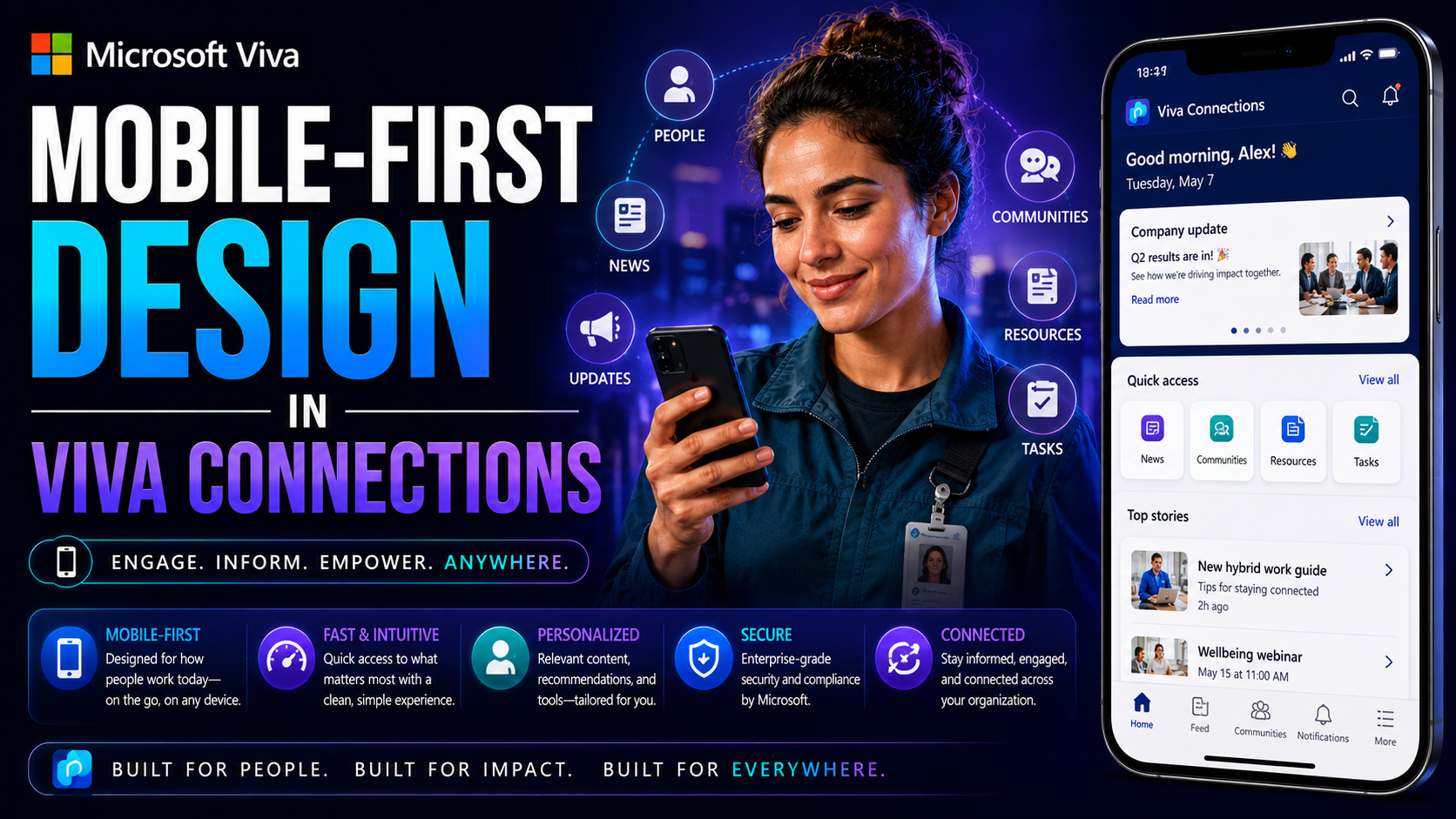
Mobile-first design isn’t just some flashy buzzword in the Microsoft Viva Connections world—it’s the foundation for employee engagement in today’s hybrid workplaces. As folks depend more on their phones and tablets to connect, get updates, and handle business, organizations are shifting to a mobile-first mindset to keep everyone in the loop, no matter where work happens.
This article is your straight-shooter guide to mastering mobile-first Viva Connections: why it matters, how it delivers on Microsoft’s vision, and what you need to actually succeed. You’ll get practical tips, strategies, and the latest on navigating real-world challenges—from technical tools to tailoring content for every user’s pocket device. Aligning your approach with how modern employees really use technology is key. Let’s dig into making mobile work for you and your team, not the other way around.
The Rise of Mobile-First Strategies and the Benefits of Viva Connections
Think about how the workday has changed. People are out and about, checking their phones between meetings, or they’re hustling on the shop floor—not glued to a desk. Organizations see these new patterns and realize that employee engagement can’t live on a desktop alone anymore. That’s why mobile-first is climbing right to the top of the Viva Connections priority list.
Microsoft has taken these changes to heart. Viva Connections is taking shape as a platform that fits right in your pocket, letting every employee—from the field tech to the team lead—stay connected and productive. This shift is about meeting people where they are, whether that’s in an office chair or sorting inventory in the back room. Being mobile-first helps organizations reach entire workforces, not just the folks with laptops.
On the other side, it’s not just about mobility for mobility’s sake. Mobile-first design in Viva Connections delivers faster access to key info, personalized experiences, and more meaningful engagement. By thinking mobile right from the start, teams can boost adoption rates and make it easier for everyone to find what matters, when it matters. Below, we’ll break down the philosophies driving these changes and explain why mobile experience is now a strategic must-have, not just a nice-to-have.
Context-First and Mobile-First: Why Context Is Everything for Mobile Experiences
Designing for mobile isn’t only about fitting content onto a smaller screen—it’s about fitting into a user’s life. Mobile-first means you prioritize the mobile experience, but context-first digs a layer deeper. Context means understanding what your users are doing, where they are, what device they’re holding, and what they actually want in the moment.
In Viva Connections, context-first means thinking: is this a quick status update during shift change, a how-to guide in a busy warehouse, or a touchpoint for a manager juggling multiple teams? If you only mirror your desktop content or features, you risk missing out on these critical cues and moments that can actually drive engagement.
That’s why blending context-first with mobile-first is so strategic. A frontline worker needs bite-sized, actionable cards—maybe urgent announcements or shift reminders—while a desk-based leader might want to see dashboards and analytics. Context-aware design keeps experiences relevant, trims away distractions, and meets users in their moment of need, not just where it’s convenient for IT.
Take the classic case: a mobile user quickly scans a notification, needs a one-tap response, and moves on. If the interface expects desktop-style interaction, they’ll get frustrated or tune out. Put context at the center, and your mobile design will resonate instead of just taking up screen space.
Tailoring Differentiated Mobile Experiences for Higher Engagement
Let’s face it, nobody wants a watered-down desktop dumped onto their phone. Real engagement comes from a mobile experience that feels custom-fit—fast, personal, and clear. In Viva Connections, this starts with listening to what your people need and then tailoring the mobile app to match different roles, locations, or business goals.
Mobility offers a chance to craft unique journeys. You want the plant worker to get real-time safety updates, the retail manager to see their team’s daily highlights, and the corporate staffer to check policy news—all without unnecessary clutter. Personalized layouts and content logic let you deliver what’s relevant, keeping users coming back instead of ghosting the app.
This section isn’t just about best intentions; it’s about practical design patterns and actionable content techniques. Subsections ahead will walk through how adaptive cards, flexible layouts, and precise messaging can transform generic interfaces into standout mobile experiences. Mastering these strategies ensures your workforce doesn’t just use Viva Connections, but actually likes it—and that’s where higher adoption lives.
Advanced Content Creation Patterns for Mobile Adaptive Cards
- Responsive Layouts: Design adaptive cards that scale gracefully on any device by using flexible containers and avoiding fixed pixel sizes.
- Compact Visuals: Prioritize simple, bold visuals and tight text blocks to prevent overwhelming small screens, keeping information bite-sized and digestible.
- Modular Components: Build reusable content elements that snap together for different scenarios, making updates and personalization a breeze.
- Optimized Media: Compress images and use vector graphics to speed up load times while maintaining visual clarity on mobile.
- Streamlined Actions: Limit interactive elements to quick, clear choices—like one-tap responses—that match on-the-go usage habits.
Comparing Mobile Users Versus Desktop Users: Avoiding the Parity Trap
Mobile users and desktop users aren’t cut from the same cloth, and their needs tell that story. In Viva Connections, it’s easy to think “let’s make everything match,” but that can be a trap—especially on mobile. If you chase feature parity for the sake of it, you end up building clunky, overloaded apps nobody actually wants to use on a phone.
This section sets up the real differences in how folks use Viva Connections based on their device. It’s not just about screen size; it’s about session length, context, and what they’re trying to accomplish. Mobile users tend to snack on content, get in and out fast, and need streamlined workflows. Desktop users might linger, multitask, or go deeper into data or documents.
As we dig into this topic, we’ll spotlight not just the contrast in behaviors but also how to avoid cross-platform confusion. The goal is to design smart: give each group what they need, without duplicating clutter or overstuffing your mobile experience. Next, you’ll see short, punchy breakdowns on major user differences and how to build for both, without falling into the parity trap.
Mobile Users Versus Desktop Users: Key Differences in Needs and Behaviors
- Session Duration: Mobile users spend less time per session, often just seconds, while desktop users may engage for minutes at a time.
- Information Consumption: Mobile favors bite-sized, actionable content; desktop supports longer articles, detailed lists, and dashboards.
- Interaction Style: On-the-go users need big tap targets and simple navigation, whereas desktops allow for intricate menus and multitasking.
- Notification Response: Mobile users expect immediate, context-relevant notifications they can act on with a tap, not buried behind two clicks.
- Device Constraints: Limited screen real estate and on-the-fly connectivity shape mobile design—desktop users don’t face these same limits.
Overcoming the Mobile Parity Trap and Cross-Platform Confusion in Mobile Experiences
- Prioritize Critical Features: Only bring over the must-have functions to mobile—leave advanced desktop-only features out of the phone experience.
- Embrace Platform Strengths: Use mobile’s capabilities, like camera access or location sharing, rather than just recreating desktop menus.
- Streamline Navigation: Simplify the mobile layout—one screen, one job—to keep users focused and prevent overwhelm.
- Clarify Cross-Platform Differences: Clearly communicate what’s different between mobile and desktop, so users aren’t confused by missing or changed features.
- Test with Real Users: Run user testing separately for mobile and desktop, acting on feedback to fine-tune each platform’s design.
Technical Tools for Building Mobile-First Dashboards and Cards in Viva Connections
If you want to get practical with mobile-first Viva Connections, it’s time to talk tools. Microsoft has given admins, designers, and devs quite a toolkit—especially across SharePoint integration and the Teams JavaScript SDK. These aren’t just technical gadgets for coders in a back room: they’re essential for shaping dashboards and content cards that sing on small screens.
SharePoint’s communicator options let you control what appears in the Viva Connections dashboard, tune layouts, and push dynamic content. The Teams SDK, meanwhile, opens the door to custom features, integrations with other workplace apps, and interactivity built right into the Viva Connections mobile experience. Together, these tools allow you to branch out beyond the basics and tailor what each user sees by device, role, or even location.
This section sets you up for success with a big-picture view of what’s possible and where the practical limits are right now. Next up, you’ll find concise best practices for dashboard design—ideal for anyone making user interfaces that work great on-the-go, not just on a big monitor.
Best Practices for Designing Dashboards and Viva Connections User Interfaces
- Widget Optimization: Use only essential widgets to de-clutter the mobile dashboard and surface critical info up front.
- Touch-Friendly Design: Make sure buttons and interactive elements are large enough for a thumb tap, avoiding “fat finger” mistakes.
- Consistent Visual Language: Stick to familiar colors, icons, and layouts so users instantly recognize key actions and features.
- Performance Focus: Compress images, avoid heavy graphics, and minimize data calls for snappy load times, especially on slow networks.
- Modular Cards: Break content into stackable, swipe-friendly adaptive cards for easy reading and quick action on mobile devices.
Mobile-First Limitations, Challenges, and the Path for Enterprise Deployments
Every shiny new platform has its rough edges, and mobile-first Viva Connections is no exception. Right now, there are real limitations to consider—missing add-ins, dashboard features that are still evolving, and some customization that’s just not possible (yet). For teams managing big, complex enterprises, these gaps can turn into real headaches if you aren’t prepared.
This section gets honest about those roadblocks. Whether you’re rolling out to a few hundred employees in different regions or managing a massive, multilingual workforce, you’ll meet both technical and organizational challenges. It’s not just about tech—it’s about momentum: getting everyone onboard, adapting content for a mobile audience, and finding the right balance between uniformity and flexibility.
The good news? It’s all navigable with the right strategies and realistic planning. The next part spotlights proven ways to overcome these limitations, drawing on recent enterprise deployments to show what’s working (and what’s not) when scaling mobile-first Viva Connections for a diverse user base.
Overcoming Limitations and Challenges in Complex Enterprise Applications
- Workaround for Missing Add-ins: Use web parts, PowerAutomate flows, or embedded links to replicate missing features until native add-ins arrive.
- Tailored Customization: Leverage adaptive cards and Site Scripts to tweak dashboards for different roles or locations, even within current platform constraints.
- Performance Management: Optimize images, preload key content, and minimize dependencies to dodge slow loads for global and low-bandwidth teams.
- Change Management: Run pilot groups, use targeted training, and rely on digital “champions” to drive adoption and reduce deployment pushback.
- Multilingual and Accessibility Planning: Layer in iconography, local translations, and WCAG-compliant layouts to serve global and varied literacy needs, ensuring inclusivity enterprise-wide.
Conclusion: Strategic Alignment With Microsoft for Employee Engagement and Viva Connections Design
Mobile-first design in Viva Connections isn’t just a trend—it's a game-changer for employee engagement. When you build with mobile at the forefront, you invite everyone, from office workers to field staff, to connect and contribute. That’s how you kickstart real inclusion and drive adoption, whether someone’s tapping in from a break room or a boardroom.
Aligning with Microsoft’s platform vision ensures your organization benefits from ongoing innovation within Microsoft Teams and Viva Connections. Prioritizing user-focused and flexible mobile experiences sets you up for long-term success. Bottom line: Mobile-first isn’t optional anymore—it’s the foundation for a connected, engaged workforce ready for the future.
You Should Also Listen To
A successful Viva Connections mobile-first design must make important information and actions useful on a small screen, not merely fit them there. These episodes provide deeper architectural and adoption guidance:
- Customize Microsoft Viva Connections Dashboards — Learn how Adaptive Card Extensions and role-based personalization turn a mobile dashboard into a practical work surface.
- Govern SPFx Adaptive Card Extensions in Teams and Viva — Understand the lifecycle, ownership, data, and governance risks behind custom dashboard cards.
- Make SharePoint Search Show the Right Files First — See why navigation, targeting, metadata, and search are essential when mobile users need answers quickly.
- Microsoft 365 Copilot Adoption with Chris Hinch [Microsoft] — Explore the adoption practices that help new digital workplace experiences become part of everyday work.

Microsoft MVP | Host of M365.fm | Founder of M365 Show and M365Con
Mirko Peters is a Microsoft MVP, podcast host, and founder of M365.fm, M365 Show, and M365Con. His work connects Microsoft practitioners through podcast interviews, livestreams, and community events.
At M365.fm, Mirko hosts conversations with Microsoft MVPs, product experts, architects, and community contributors. Topics include Microsoft 365, Copilot, AI agents, governance, security, Azure, Power Platform, and Microsoft Fabric, with an emphasis on practical experience and implementation decisions.
M365.fm is the podcast and learning platform. M365 Show brings experts together for livestreams, while M365Con provides an online conference setting for community learning.
Official website: Mirko Peters (https://www.mirkopeters.com/). Recognition: Mirko Peters — Microsoft MVP profile (https://mvp.microsoft.com/de-DE/mvp/profile/9b0ca797-db5a-493a-a845-8b9158046cf5). Connect on LinkedIn (https://www.linkedin.com/in/m365showpodcast/).